Mondo Strength
& Conditioning
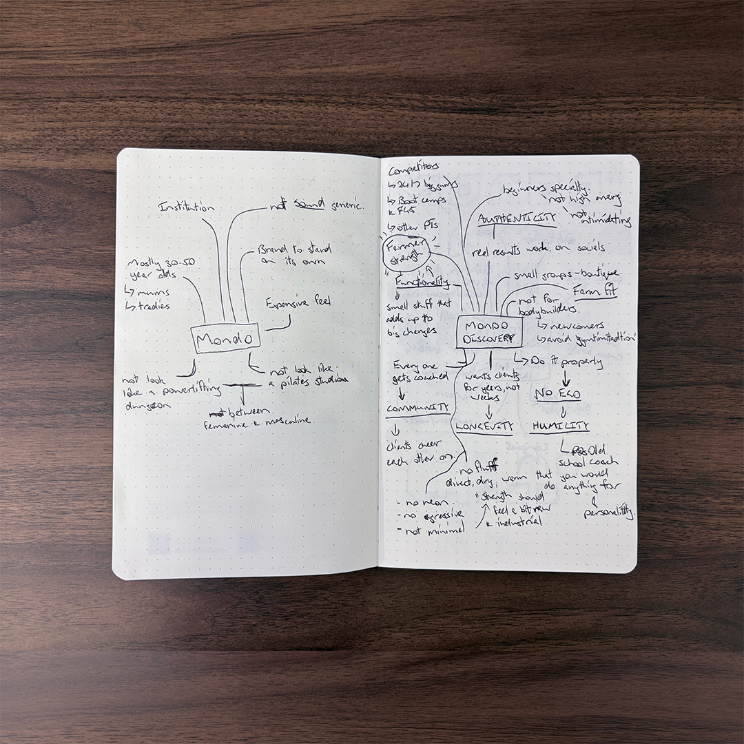
Mondo Strength is a small strength and conditioning gym founded by a coach who has spent nearly a decade teaching everyday people to lift. After years of building his coaching business on word of mouth, he was opening his first space and needed a brand that could stand on its own.
The gym is named after his grandfather, Raymond, known to everyone as Mondo, a wharfie and cane cutter who was the strongest man he ever knew. That became the heart of the identity. Mondo’s strength is a different kind from the polished, high-intensity look of modern fitness. It’s built slowly, earned over years, and useful in everyday life.
The result is an identity that feels made rather than manufactured: honest, a little worn in, and built to last.
Rationale
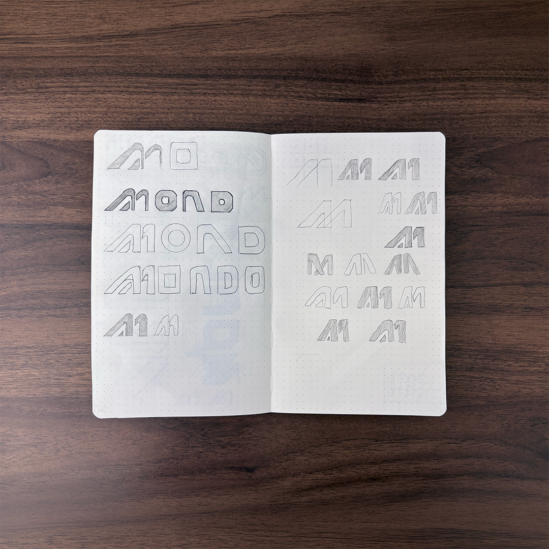
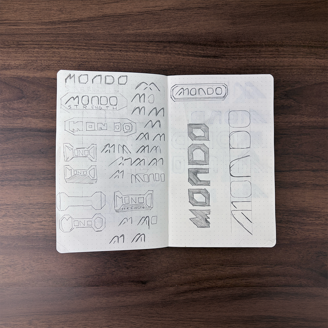
The wordmark leads with a forward-leaning M formed from angled strokes, a reference to cane grass bending in the wind. It nods to Mondo’s working roots in North Queensland while giving the mark a sense of steady forward motion.
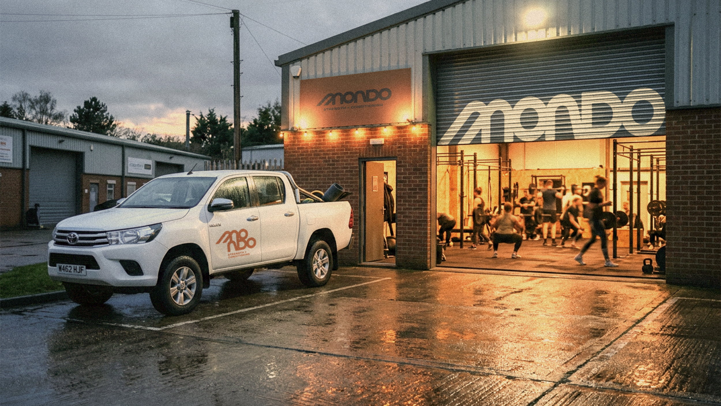
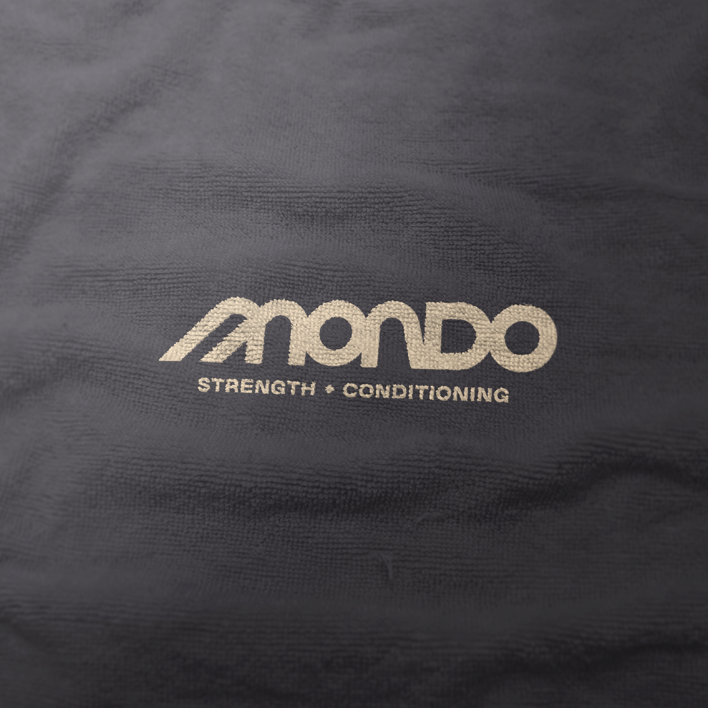
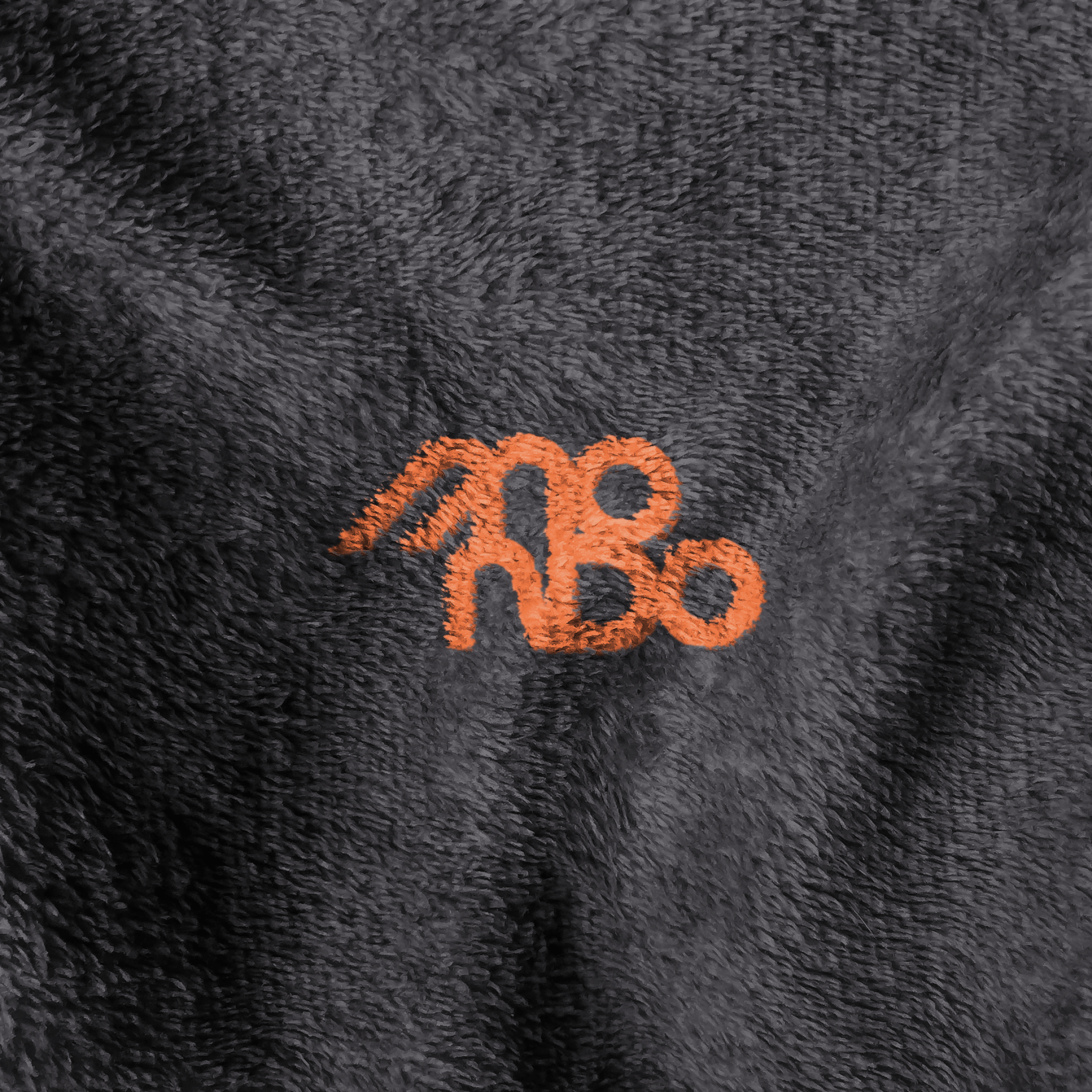
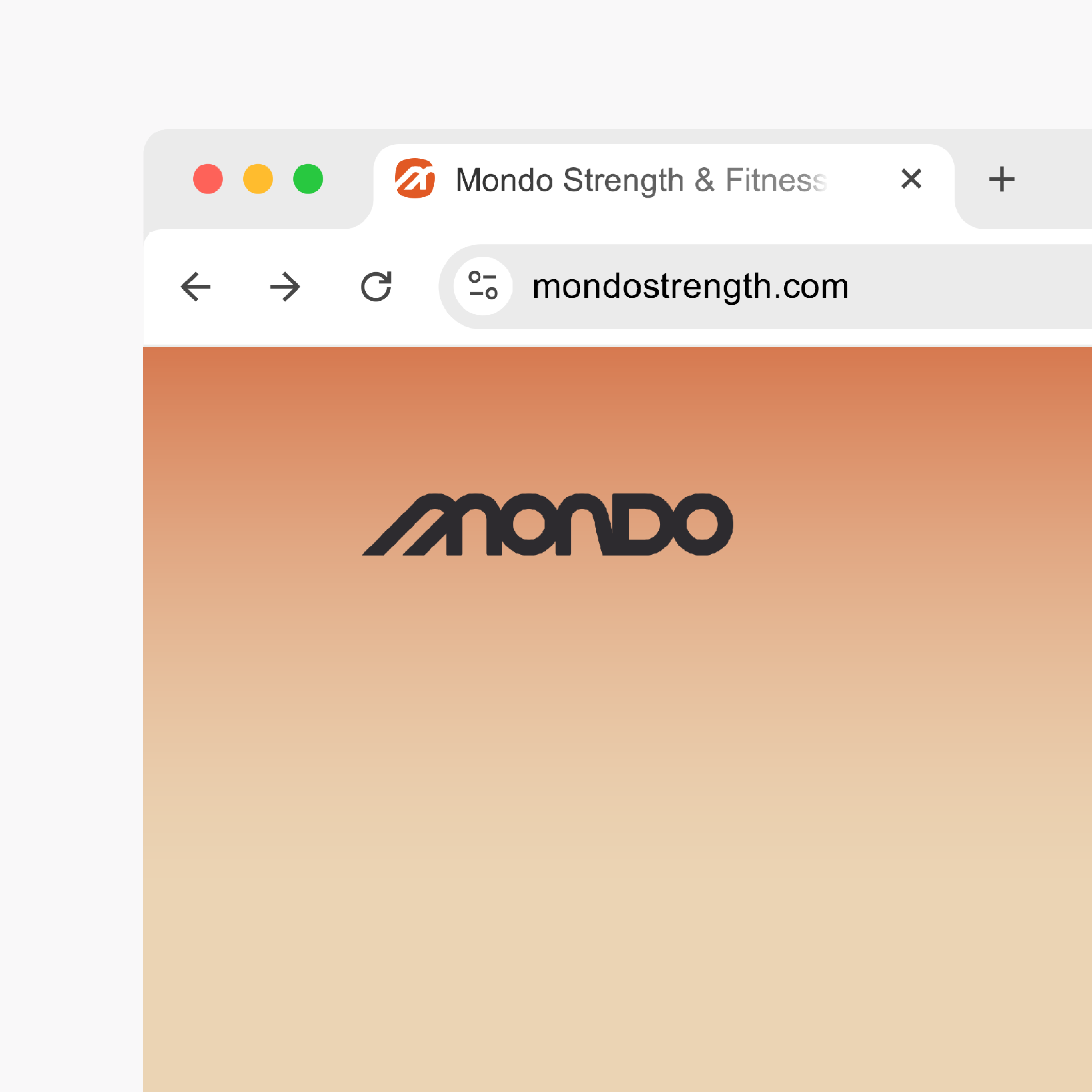
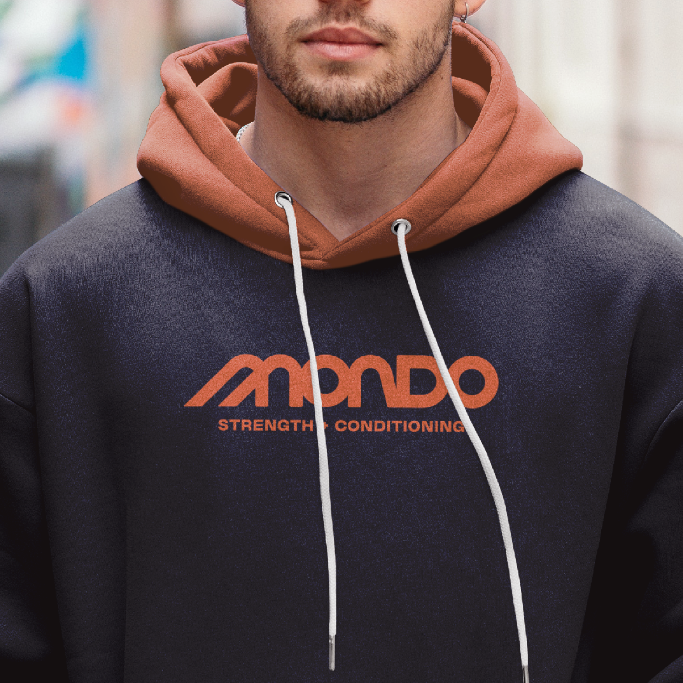
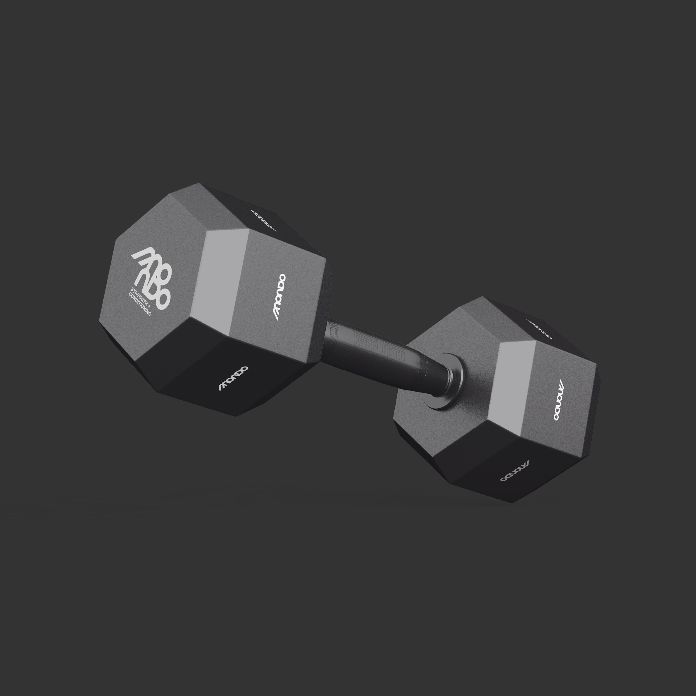
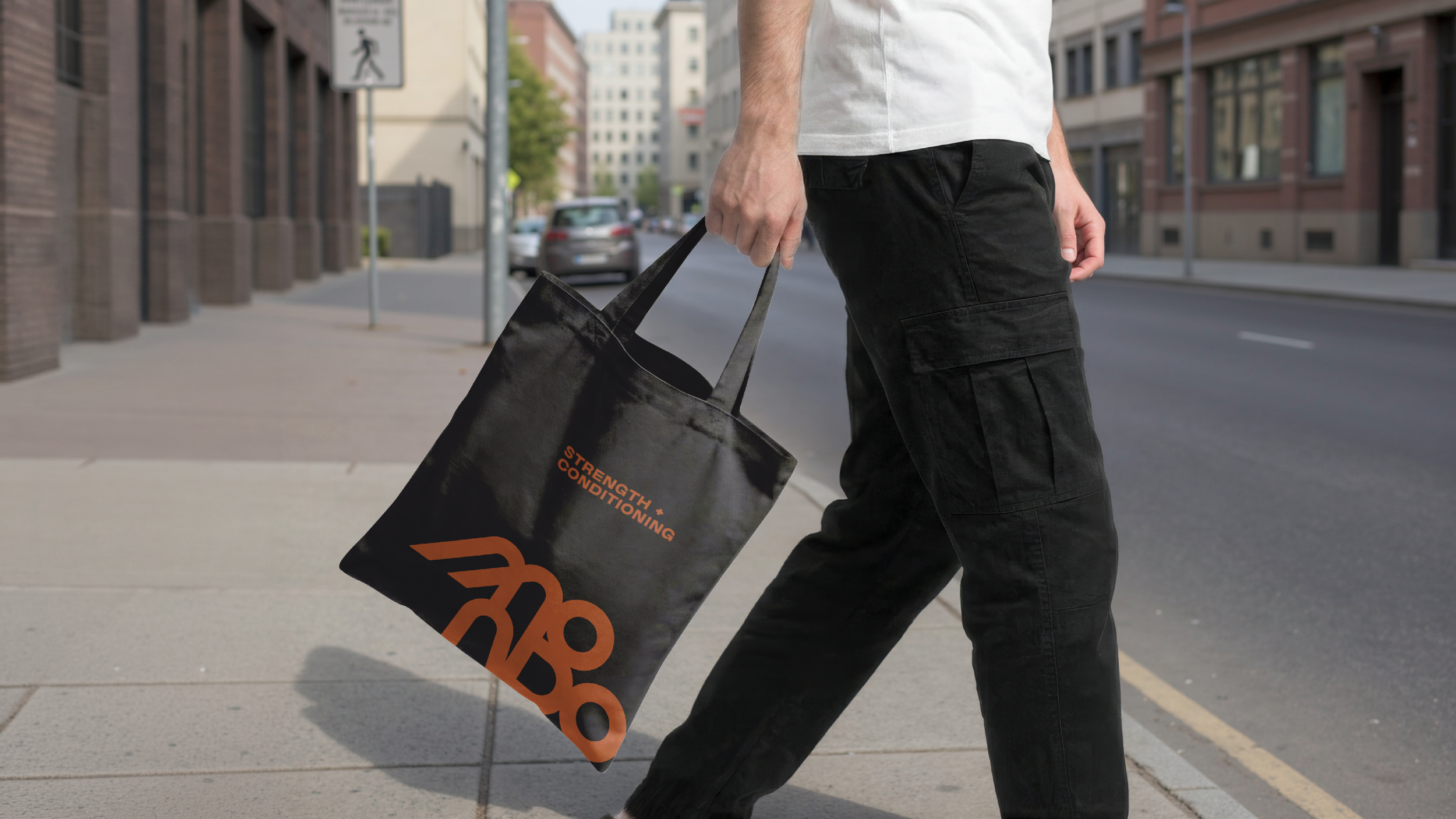
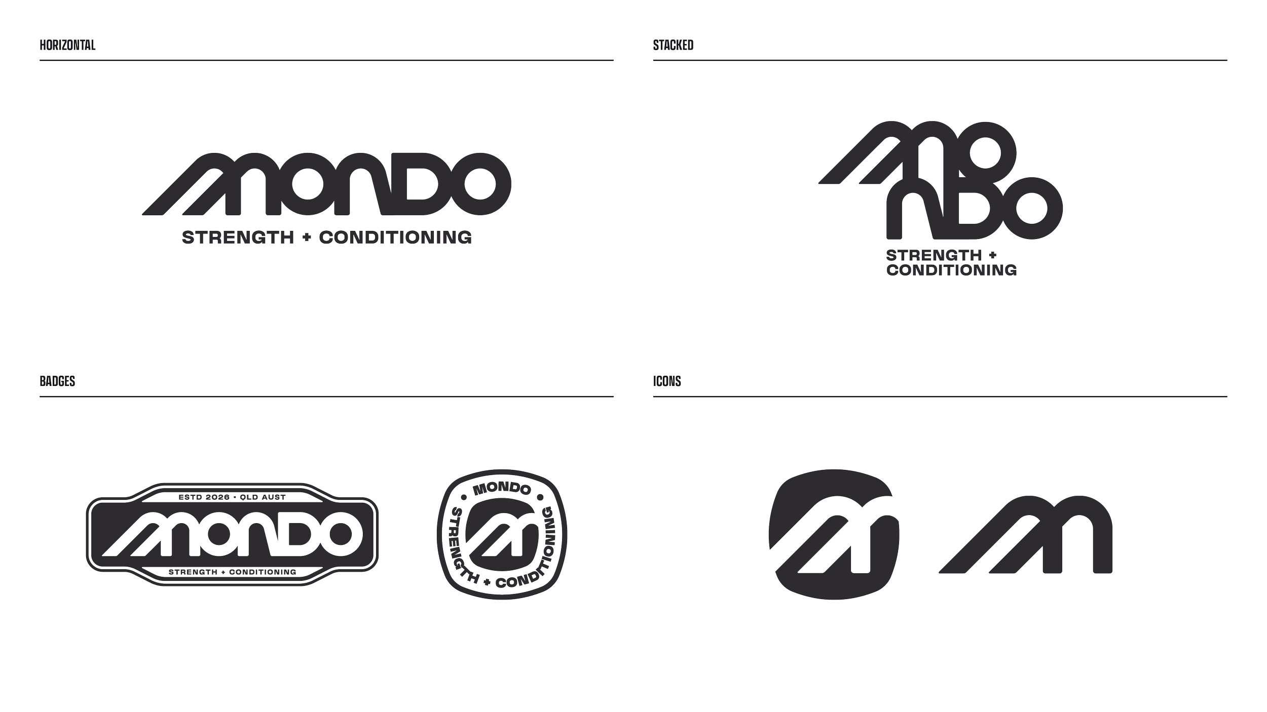
The identity is built as a flexible family of marks, so it works from a roller door to a favicon. The primary wordmark leads on signage and merchandise. The horizontal badge takes its shape from a lifting belt: long, strong and made to wrap around the brand, carrying the same sense of support and durability. A stacked monogram suits compact spaces like embroidery, equipment and vehicle livery, and a standalone M icon handles the smallest applications, such as app icons and favicons.
The typography draws on brands that existed before mass production, when products were made to be used, repaired and handed down. Rounded, heavy letterforms give the wordmark weight and warmth. A wide, plain sans for the “Strength + Conditioning” descriptor keeps things functional, and a typewriter-style face handles longer messages with a quieter, workshop feel.
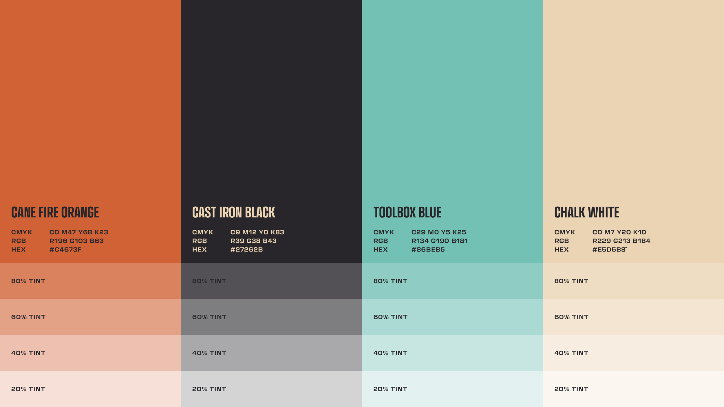
The palette comes from the same world. Cane Fire Orange takes its warmth from the cane burns of North Queensland. Toolbox Blue is pulled from the chipped paint of an old steel toolbox, Cast Iron Black gives the brand its weight, and Chalk White is the dust on your hands after a good session. Together they feel earthy, grounded and approachable rather than intimidating
Supporting graphics
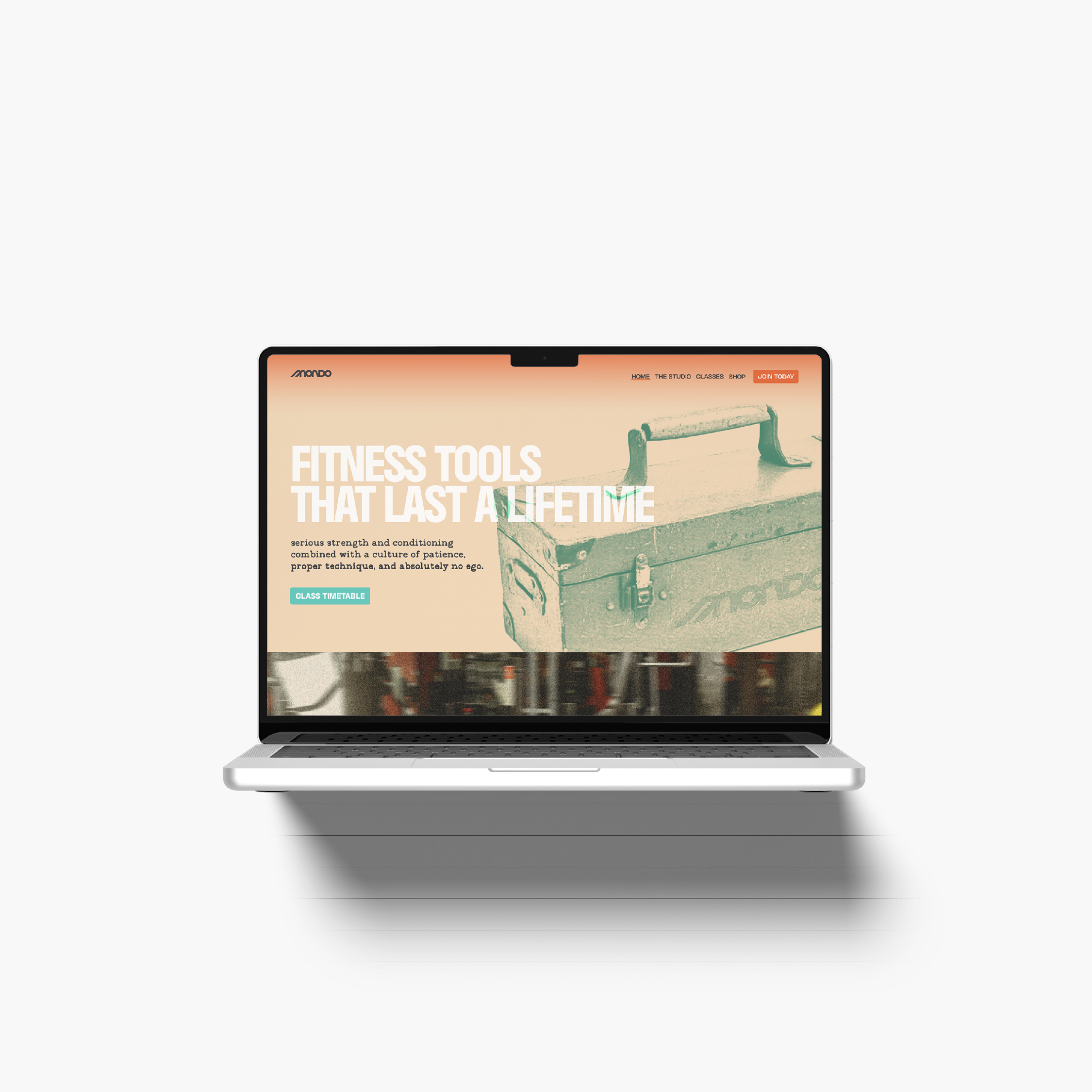
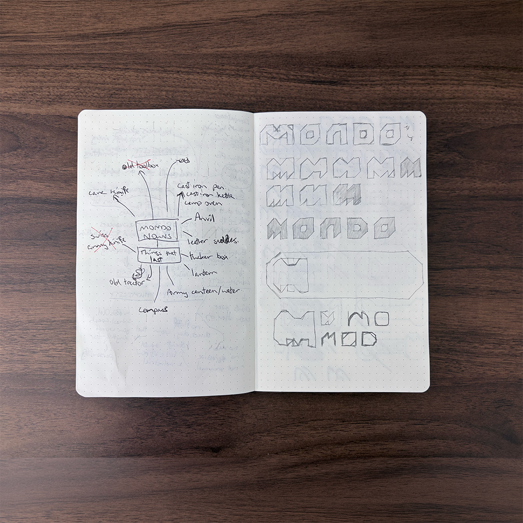
A series of stylised vintage objects carries the brand’s central idea: things that are built well last a lifetime. Each object is treated in a single brand colour with a worn, printed texture, and paired with a line that links it back to training.
The toolbox:
Tools that last a lifetime.
Dented, scratched and still doing the job. A reminder that strength built properly doesn’t wear out.
The pocket knife:
One body. Many jobs.
Compact, reliable and ready for anything. Strength isn’t for show. It’s for lifting the kids, carrying the shopping and everything in between.
The compass:
Guided training, never guessed.
An old instrument that still points true. It represents Mondo’s coached, programmed approach, where every session has direction.
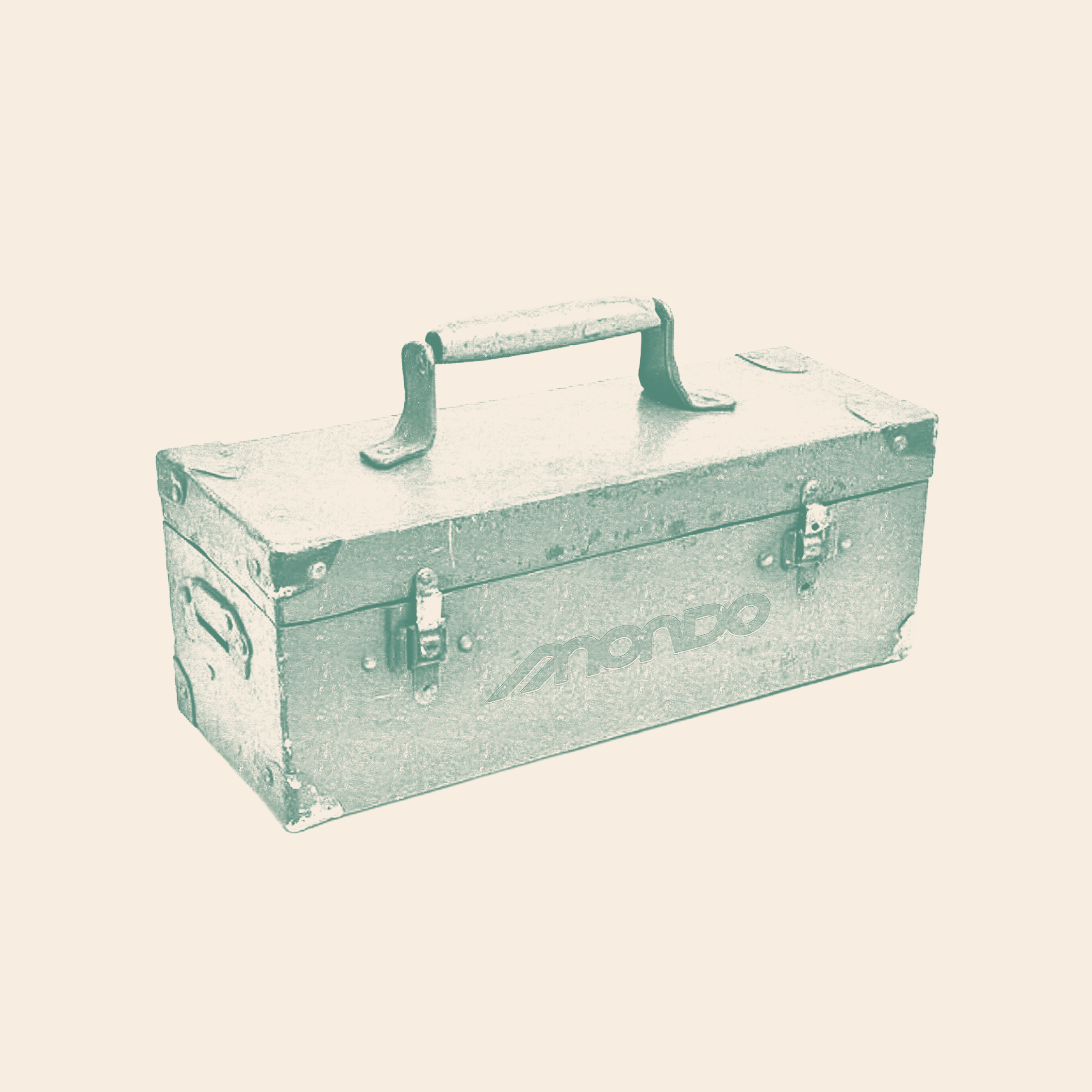
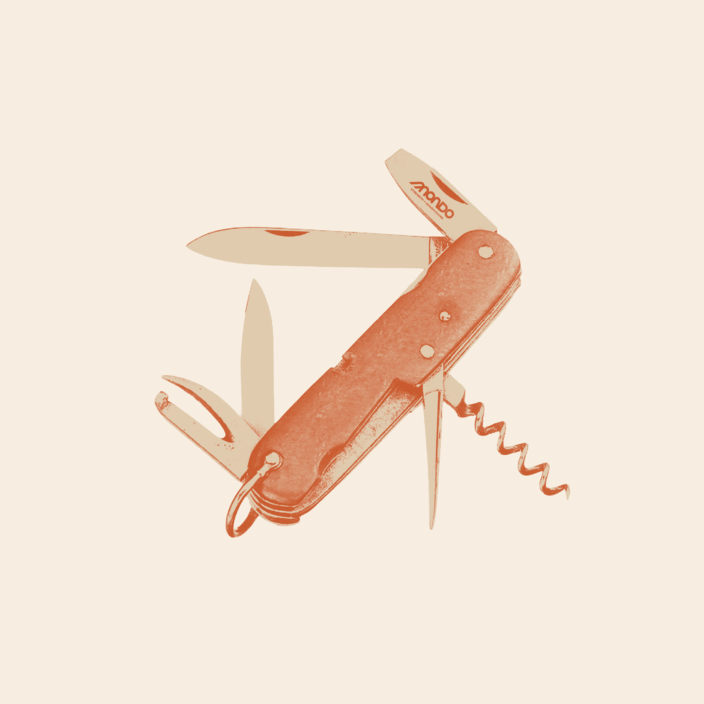
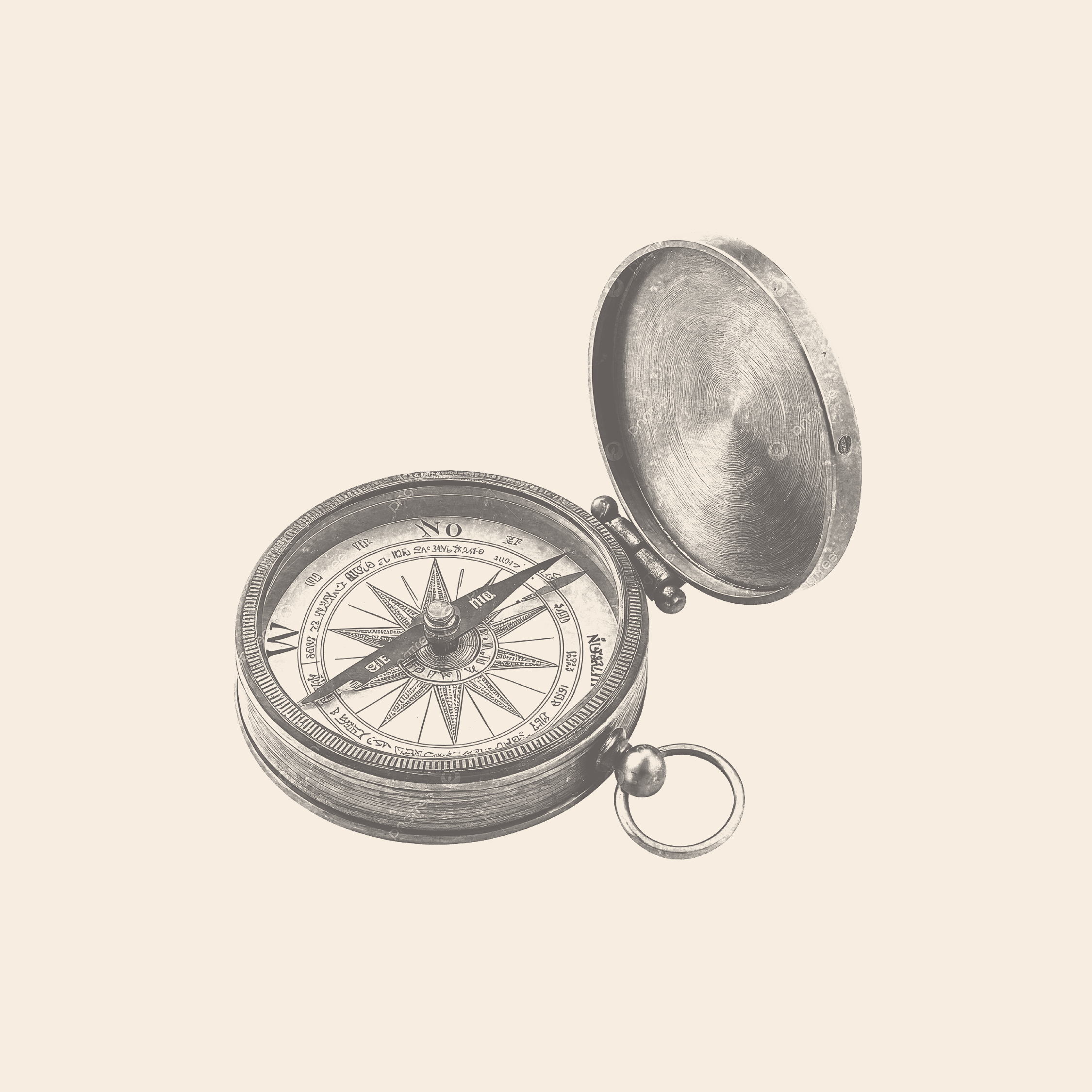
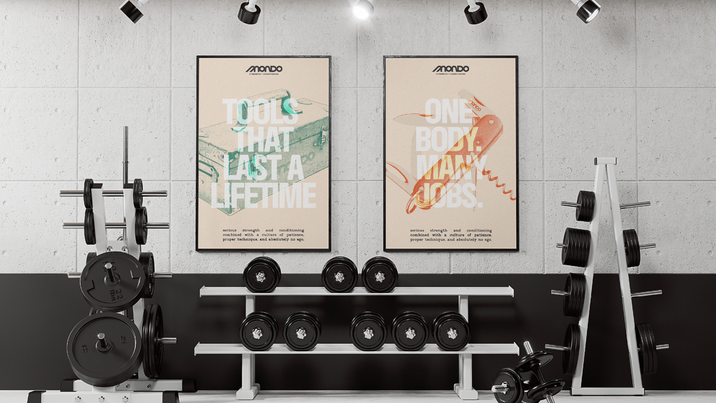
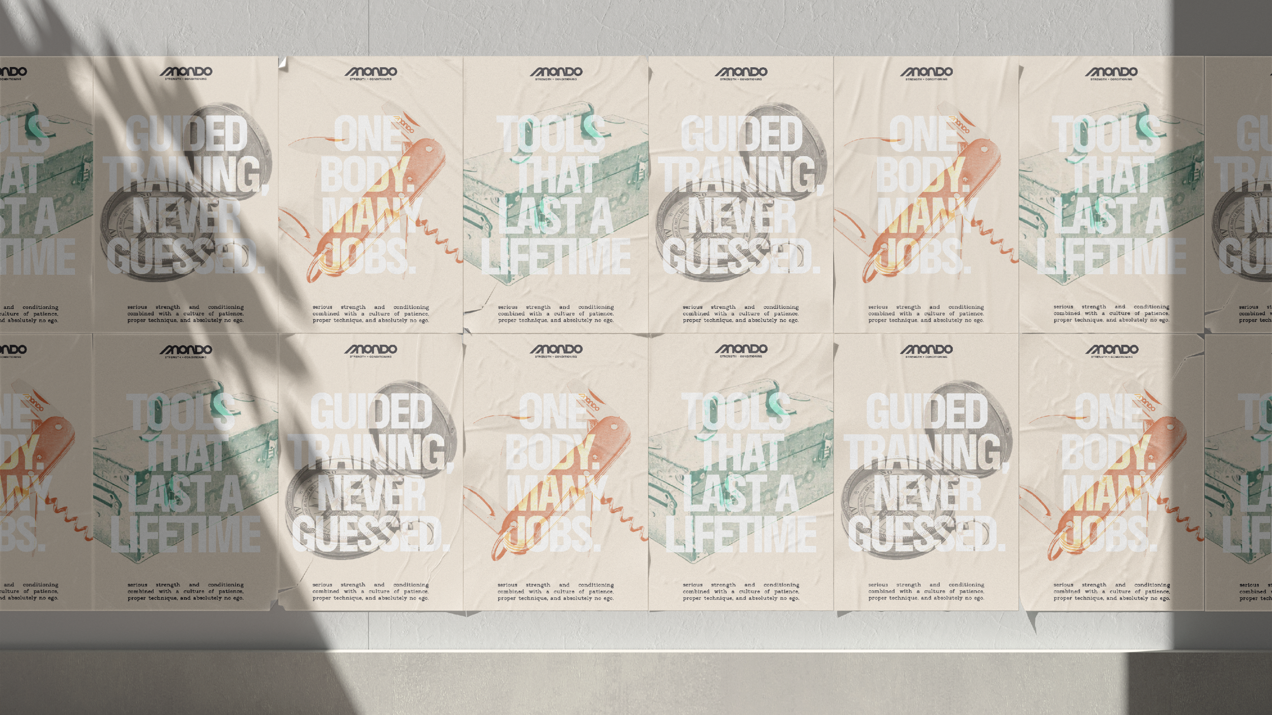
Image treatment
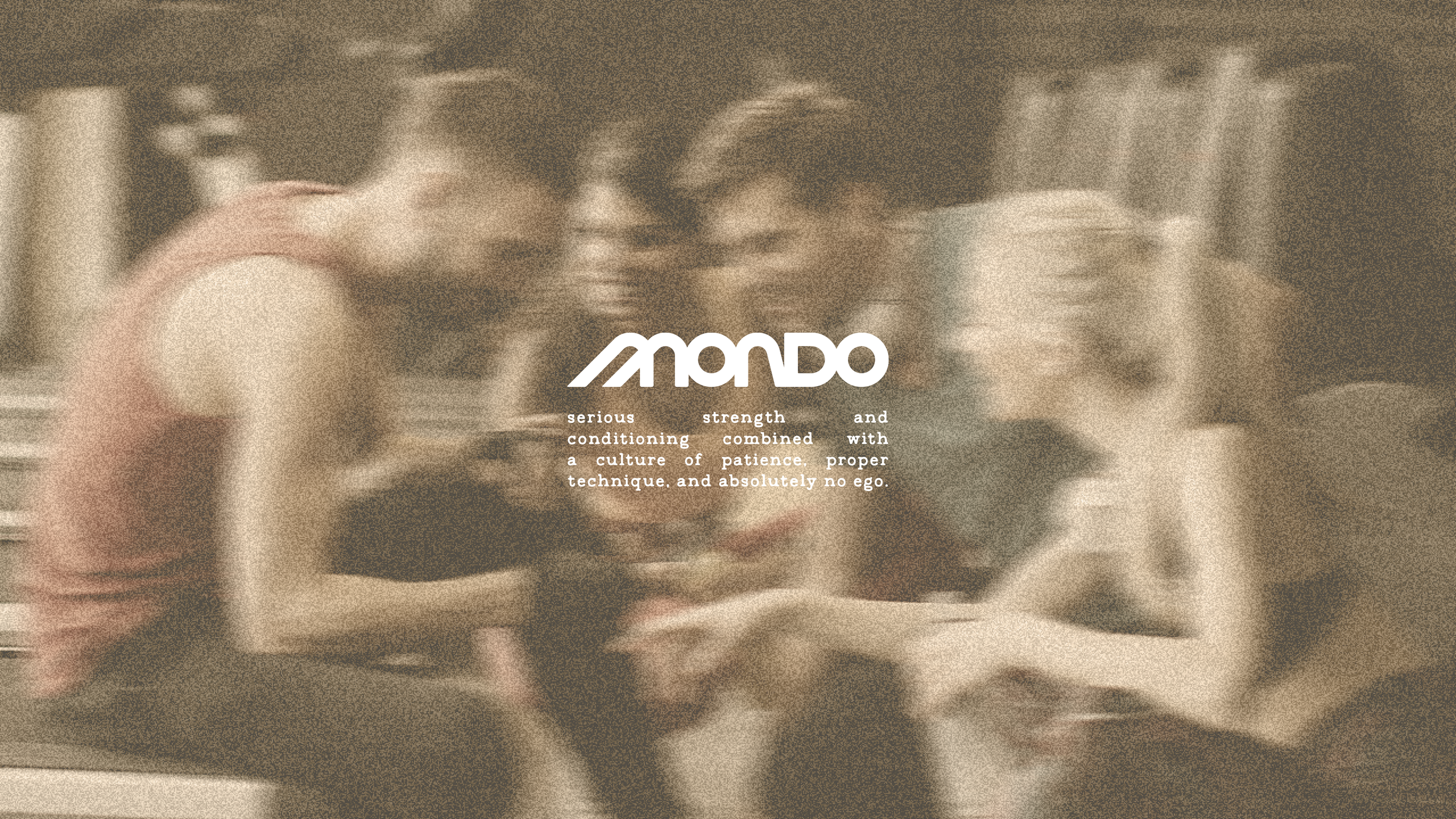
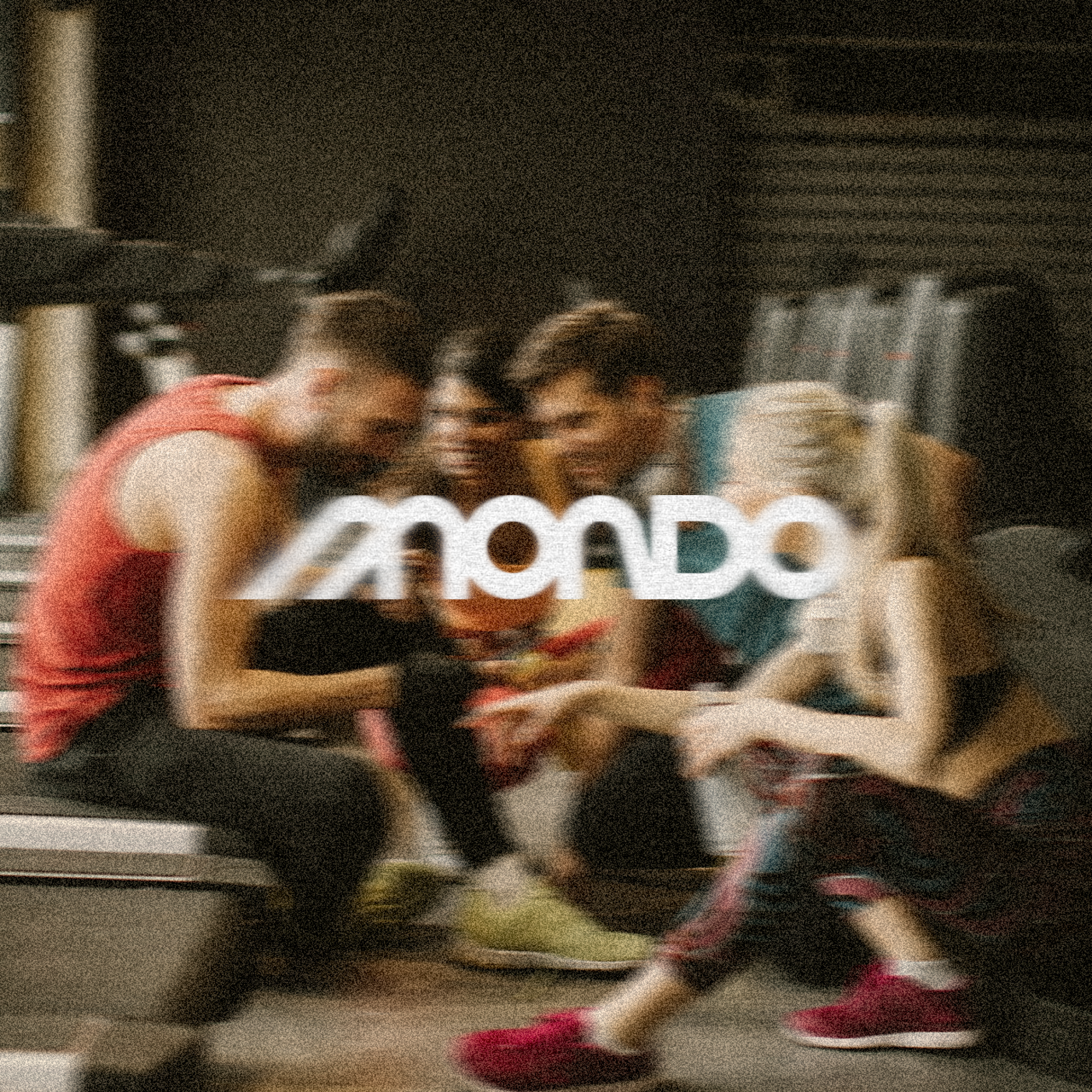
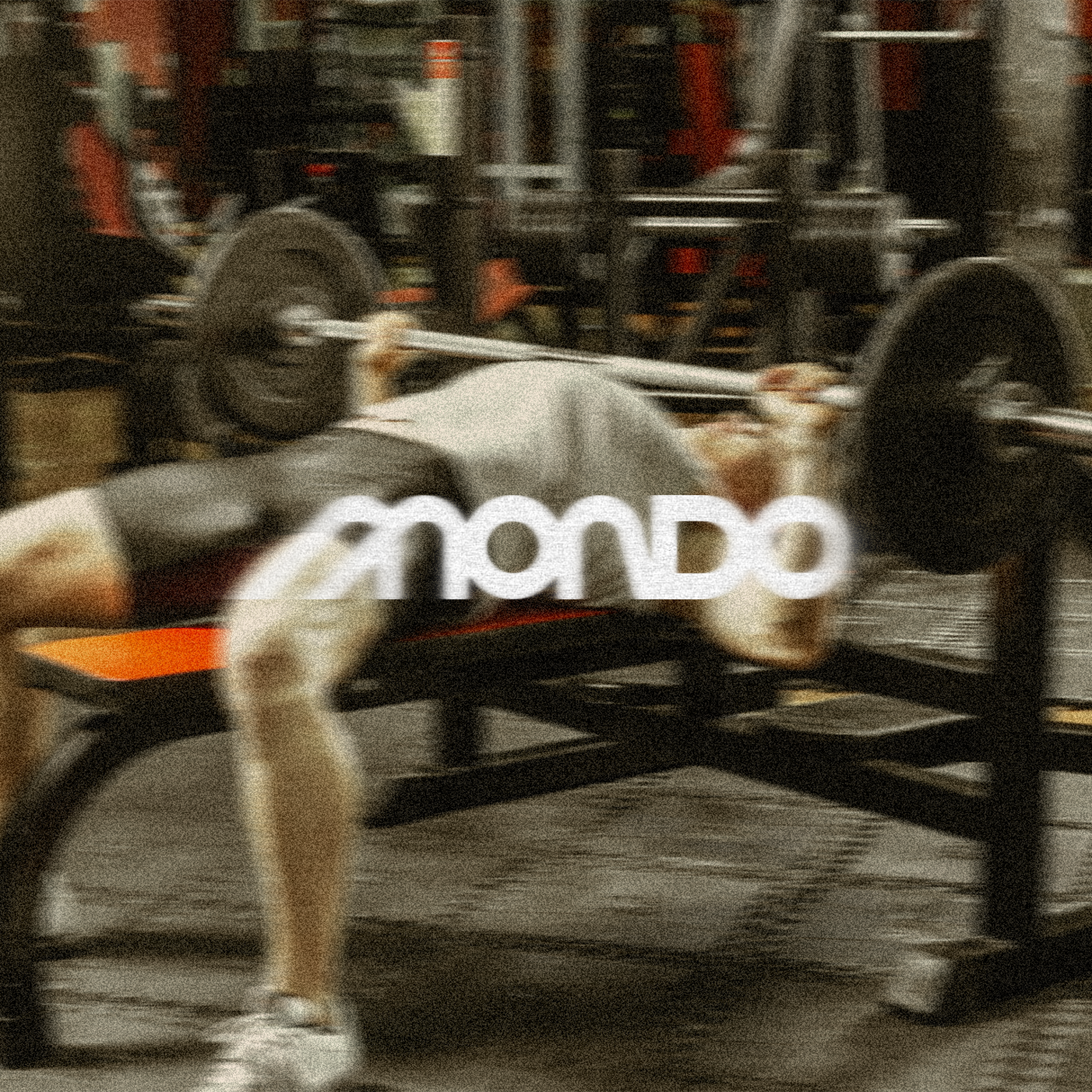
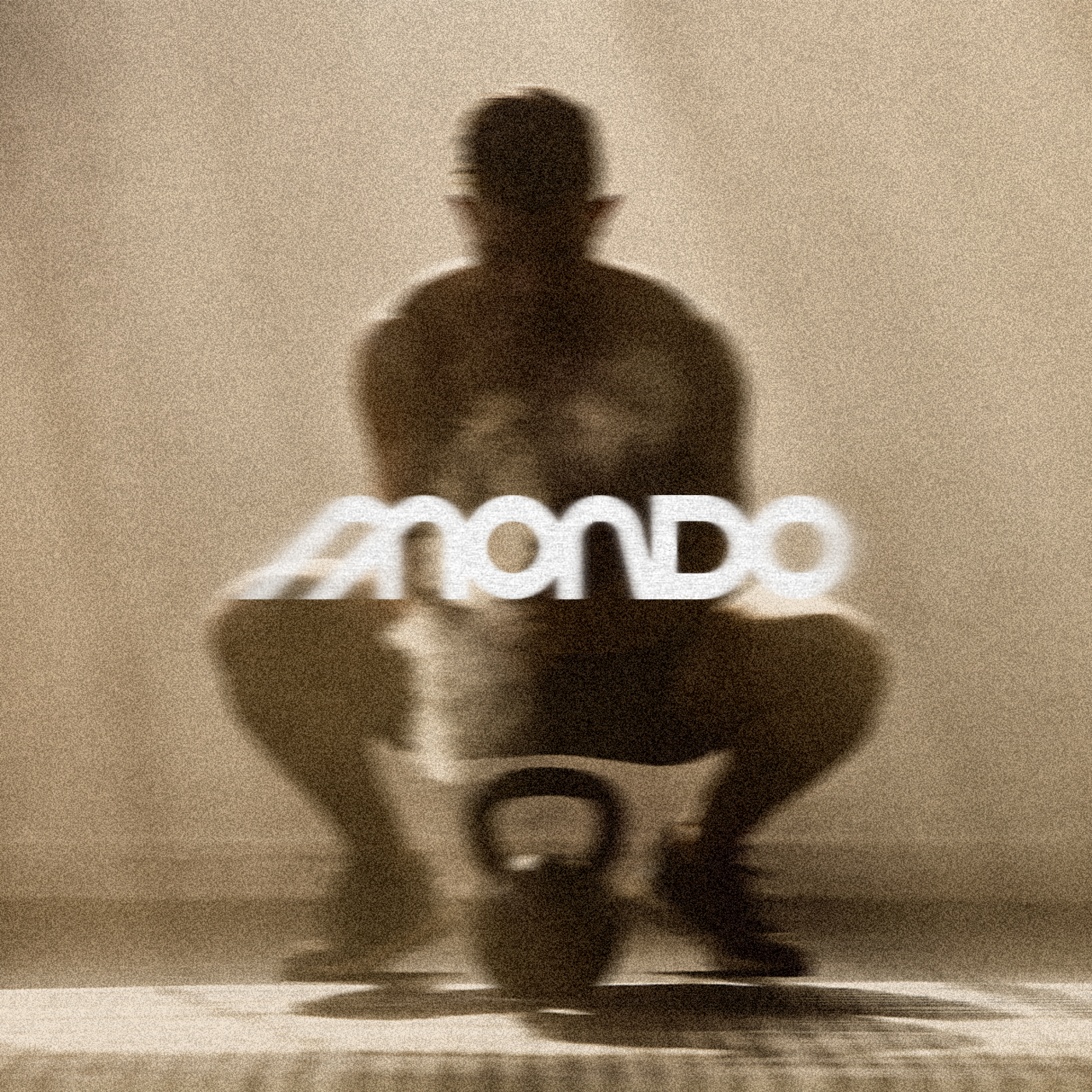
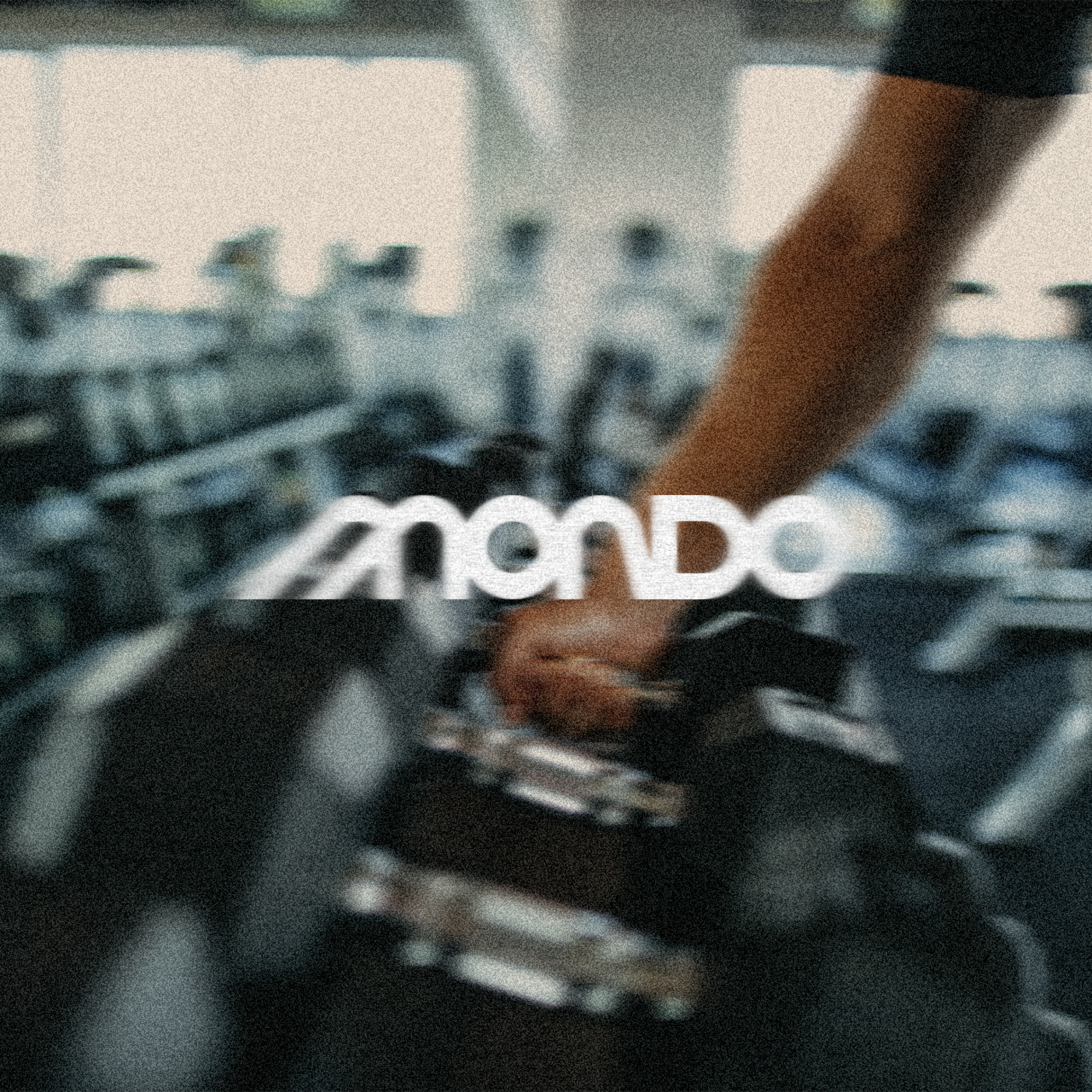
Mondo’s photography is treated to look like it was shot on an old film camera. Colours are slightly muted, grain is heavy, and focus is intentionally soft, so the images capture movement and feeling rather than perfect, staged moments. It sits in direct contrast to the high-gloss imagery common in the fitness industry, and feels closer to a family photo album than an advertising campaign.
When the logo appears over photography, it gets the same treatment. Noise, softness and a subtle blur are applied to the wordmark so it sits inside the image rather than on top of it, making the brand feel part of the scene.
BRAND IN USE