Archer
Fitness
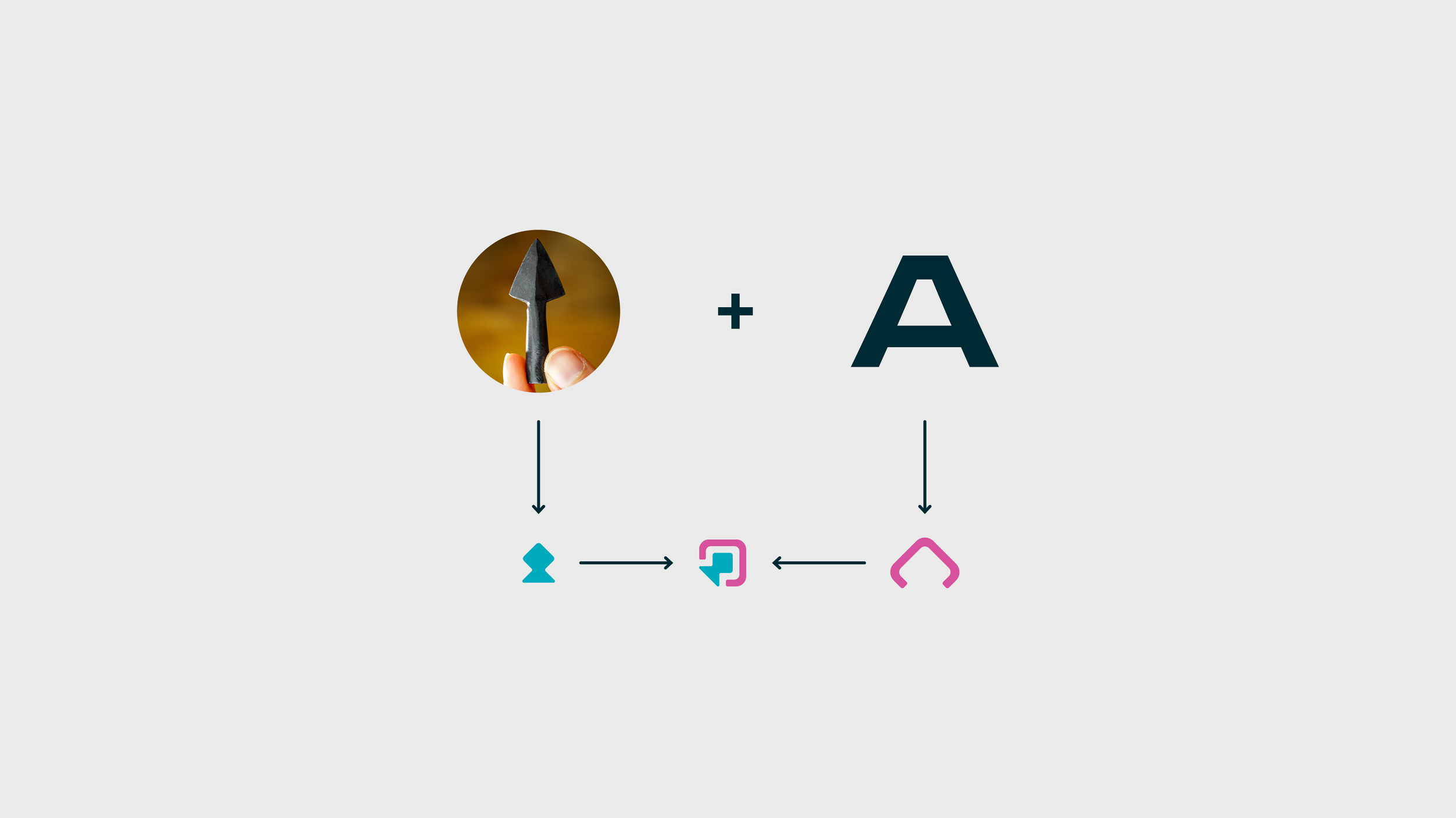
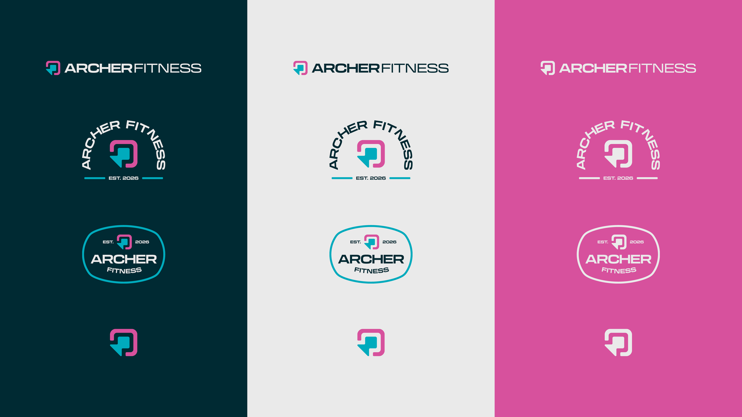
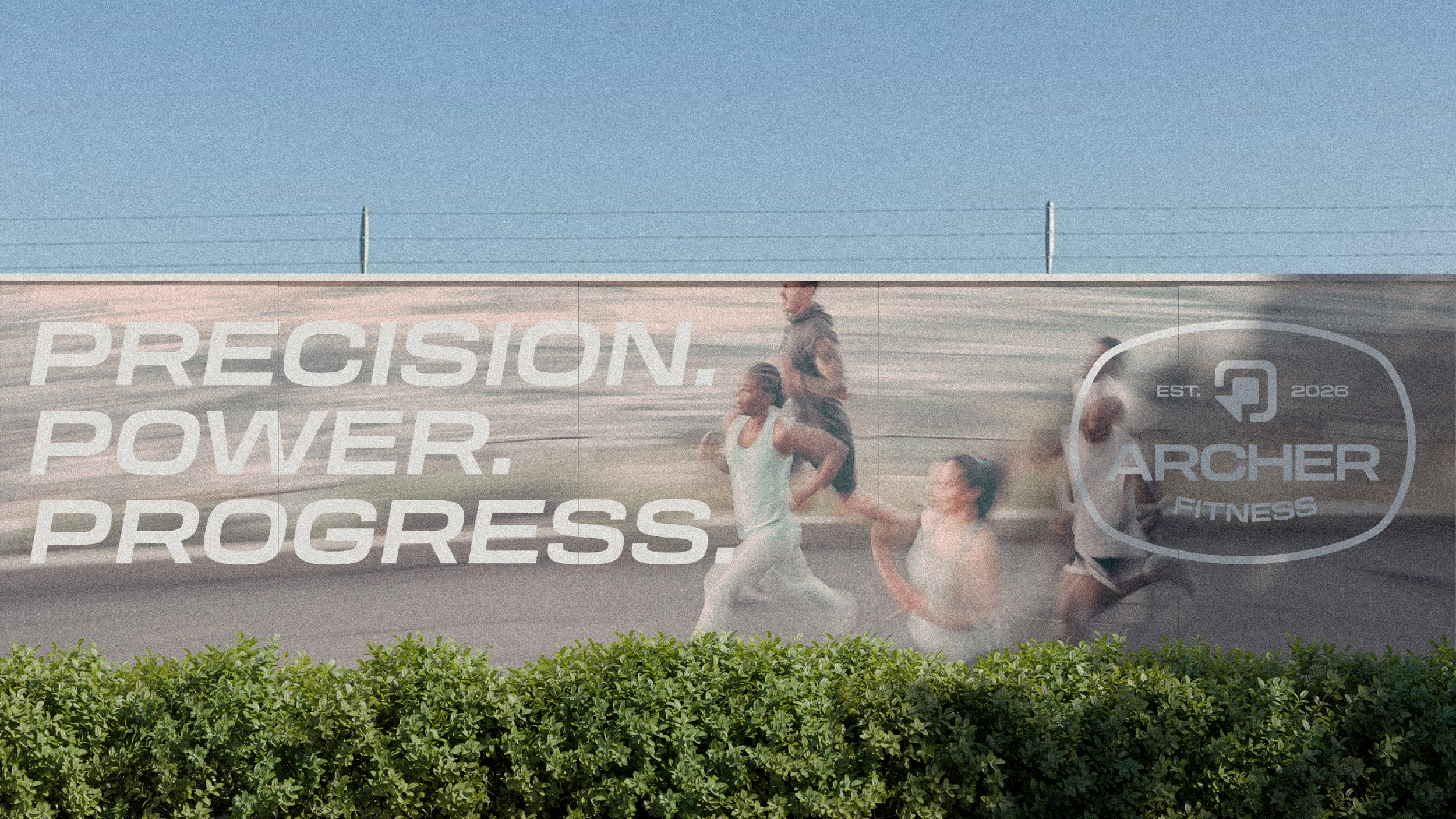
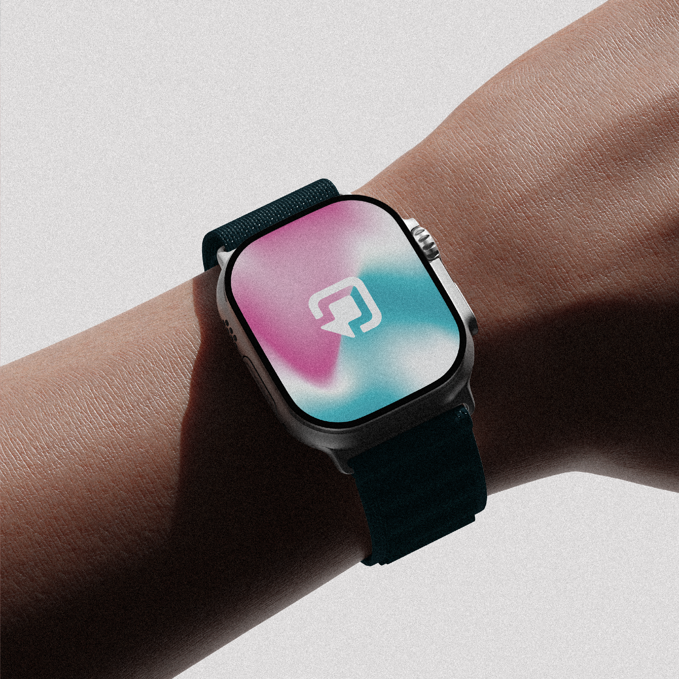
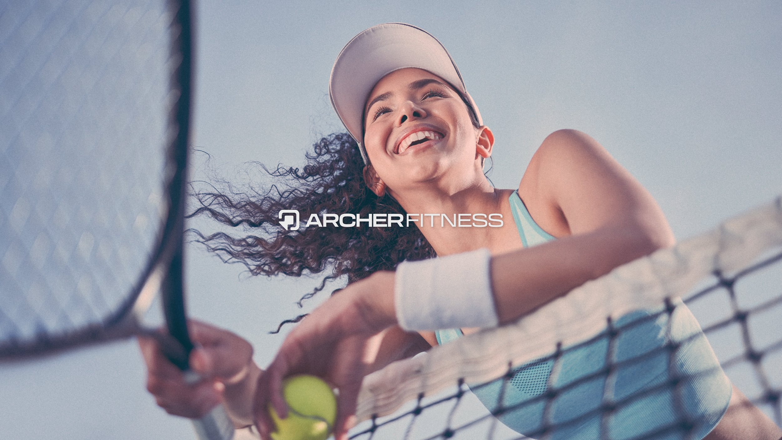
Archer Fitness wanted light, bright, and inspirational: not the navy-and-grind aesthetic every fitness brand defaults to. So the mark had to earn its warmth without losing its edge. I built the logo around an arrowhead. Not a sports cliché, but a precision symbol: every rep, every session, aimed at a target. It’s training as intent, not just effort.
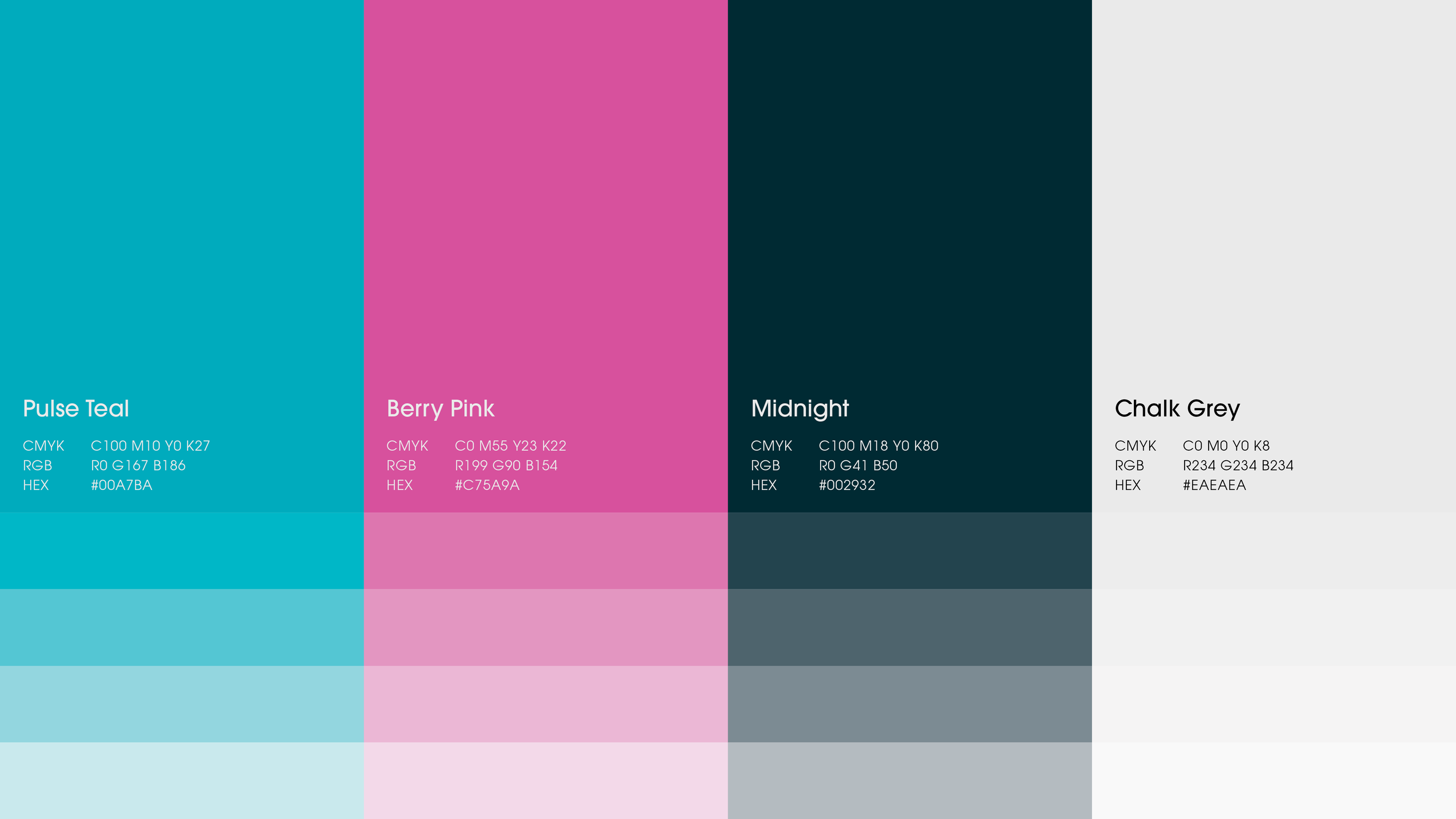
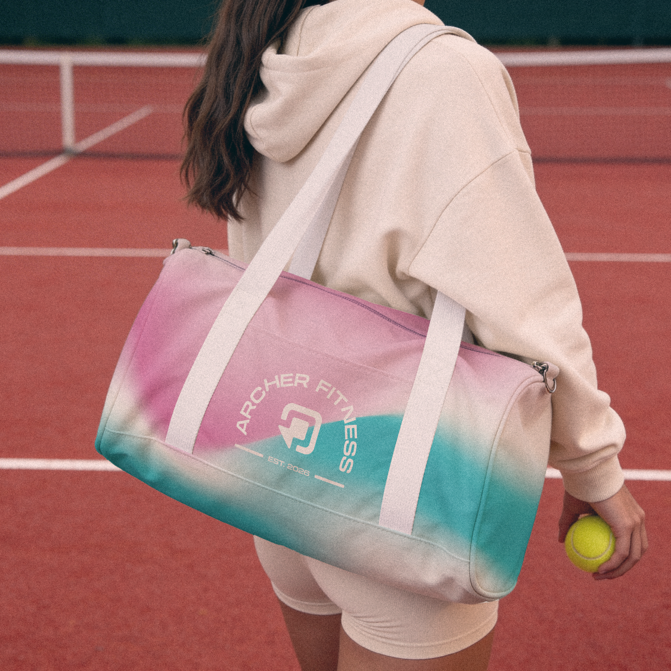
The palette is the more personal layer. Archer’s founder is a huge Nadal fan, so I pulled the colours straight from his 2015 Roland Garros kit. Pulse Teal and Berry Pink aren’t a trend call, they’re a nod only the client (and now their community) would fully clock.
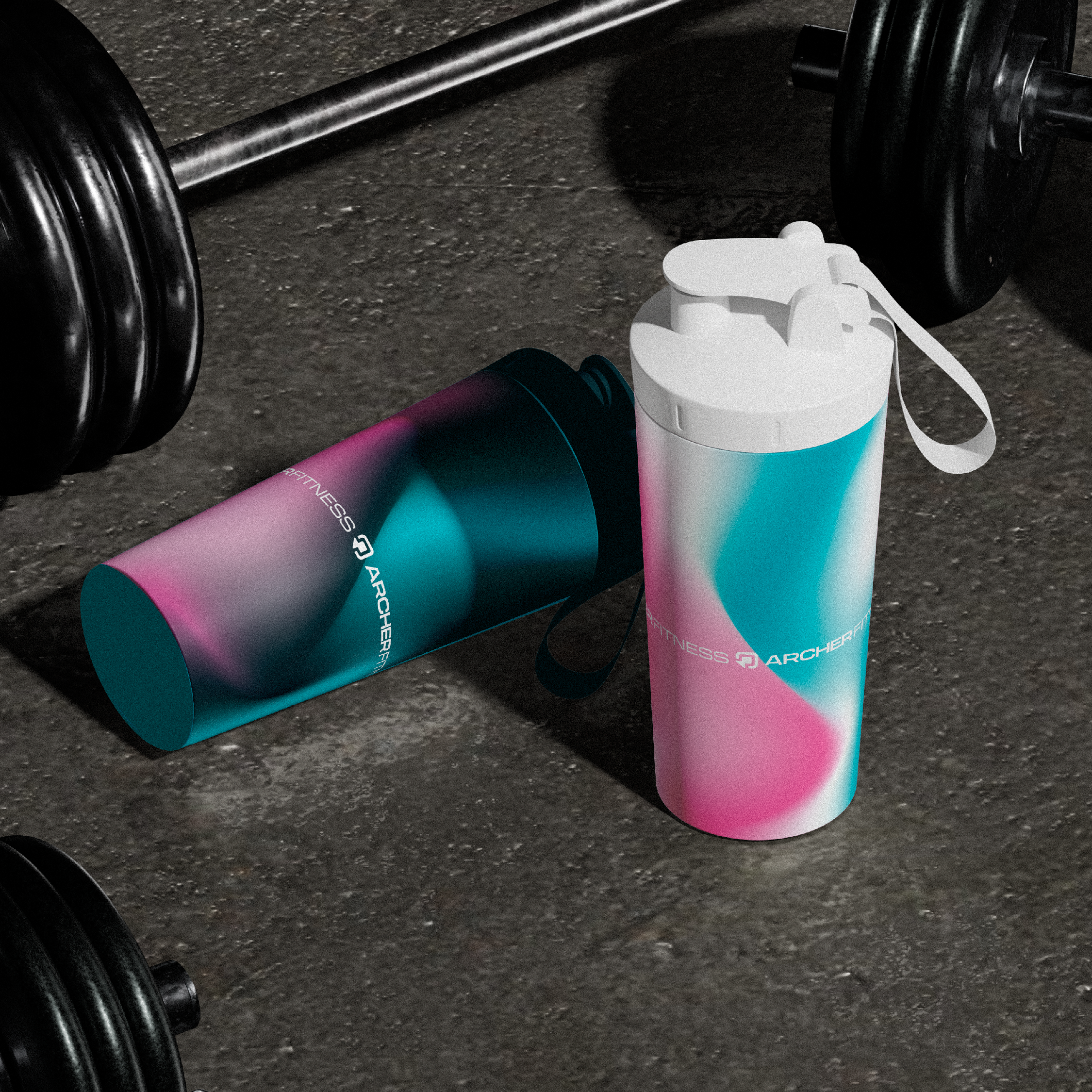
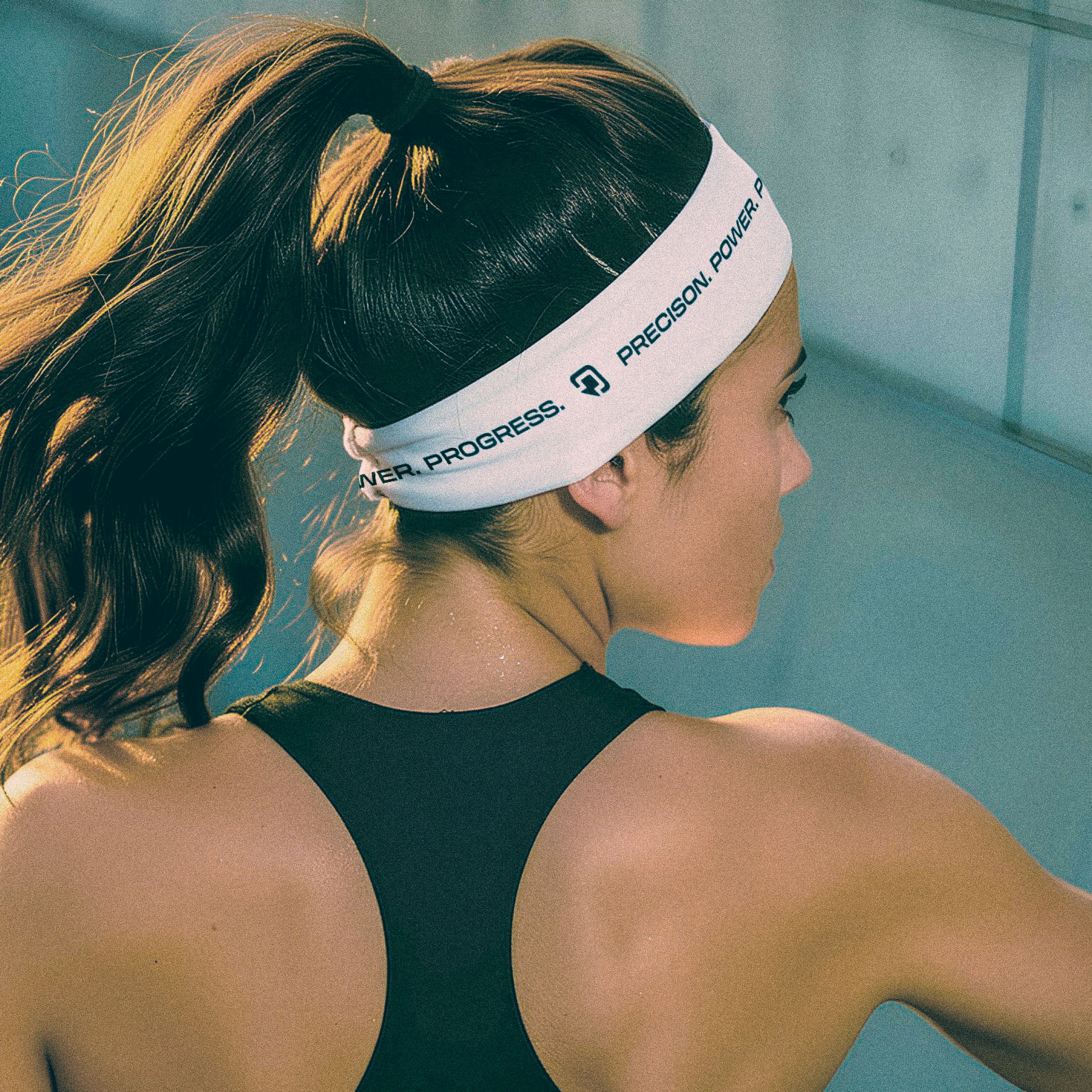
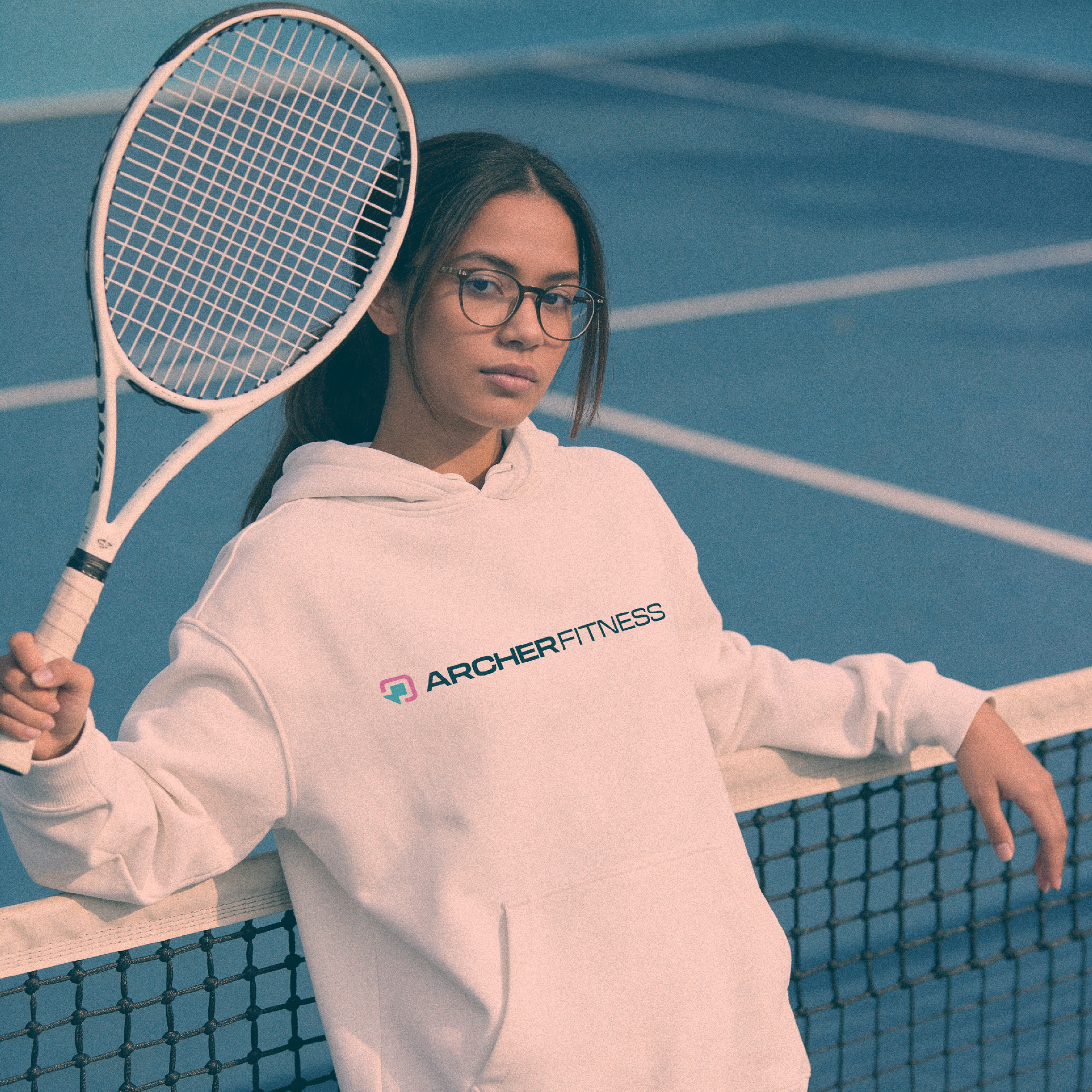
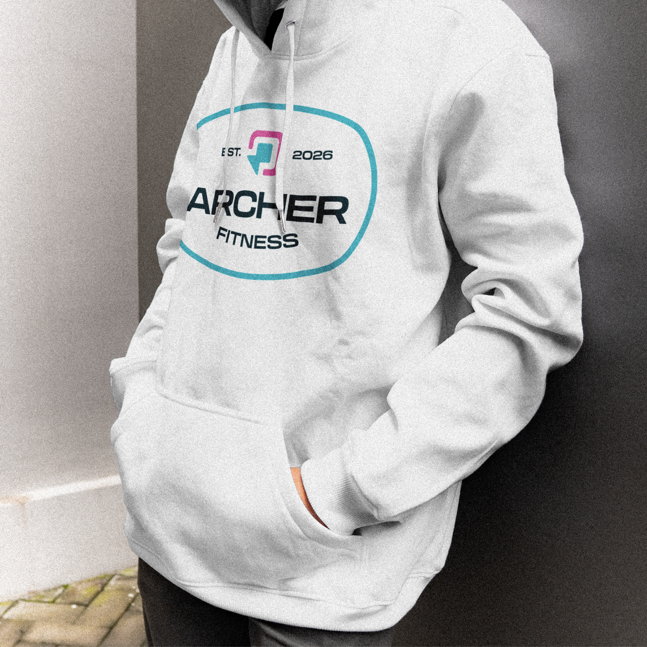
I also built the identity with one eye on where Archer’s headed next: they want to move into apparel, so the mark, palette, and wordmark all had to hold up on fabric, not just on a screen.
That’s the brand as backbone principle in miniature: even the smallest decision, a hex code, ties back to something true about the person behind the business, and to where they’re going next, not just what “fitness” is supposed to look like today.