
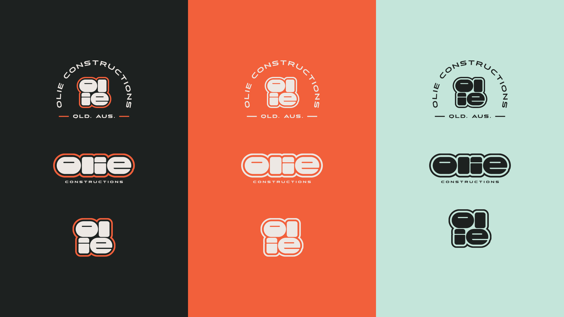
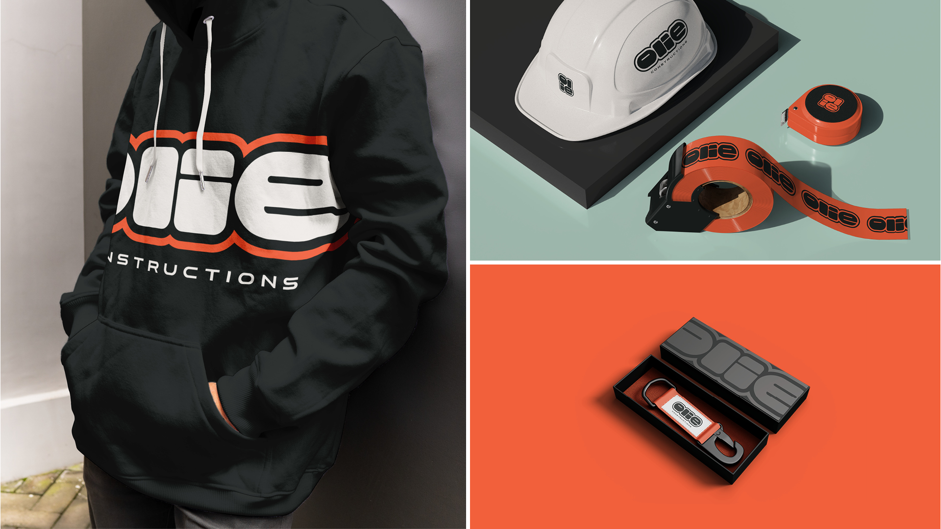
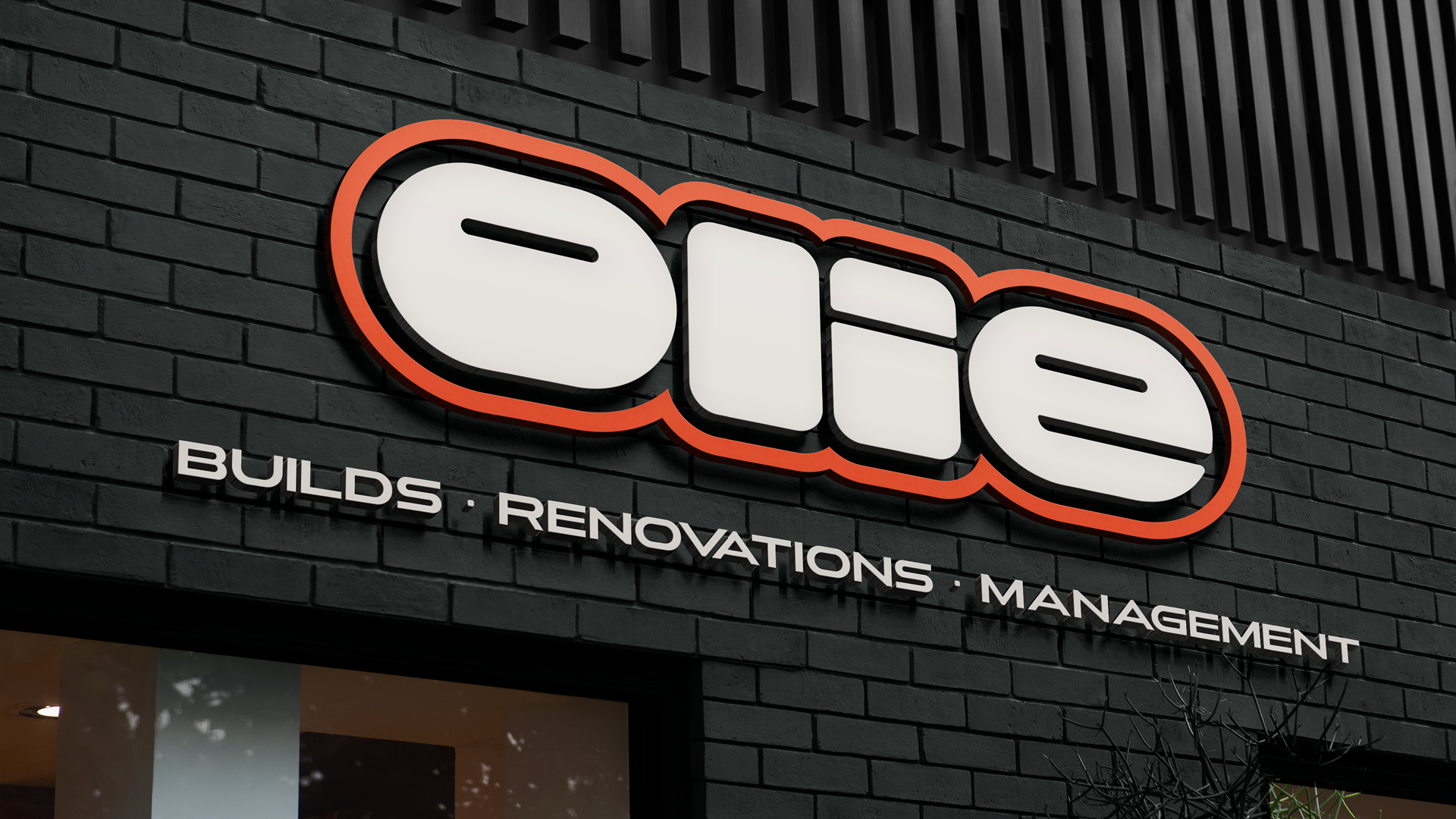
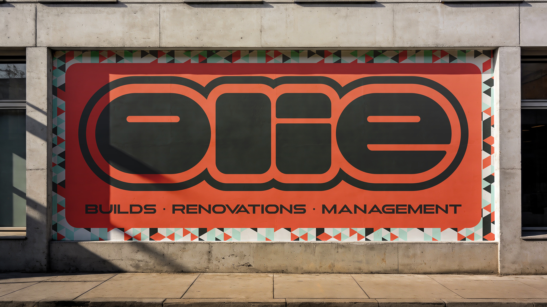
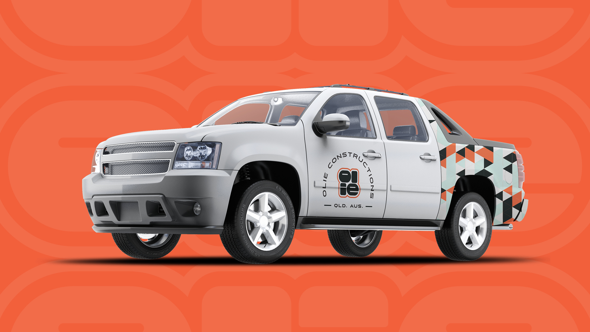
OLIE Constructions breaks the mould of traditional construction branding. Where most builders default to rigid and utilitarian, OLIE leads with a bold, youthful and energetic personality. The wordmark is the hero — a heavyset, rounded typeface with thick strokes and soft capsule forms that feel friendly and approachable while still carrying real weight. Its retro-inspired styling gives the brand a distinctive charm that stands out instantly, whether on a uniform, a billboard or a job site.

No items found.
