Niknak Fab & Co
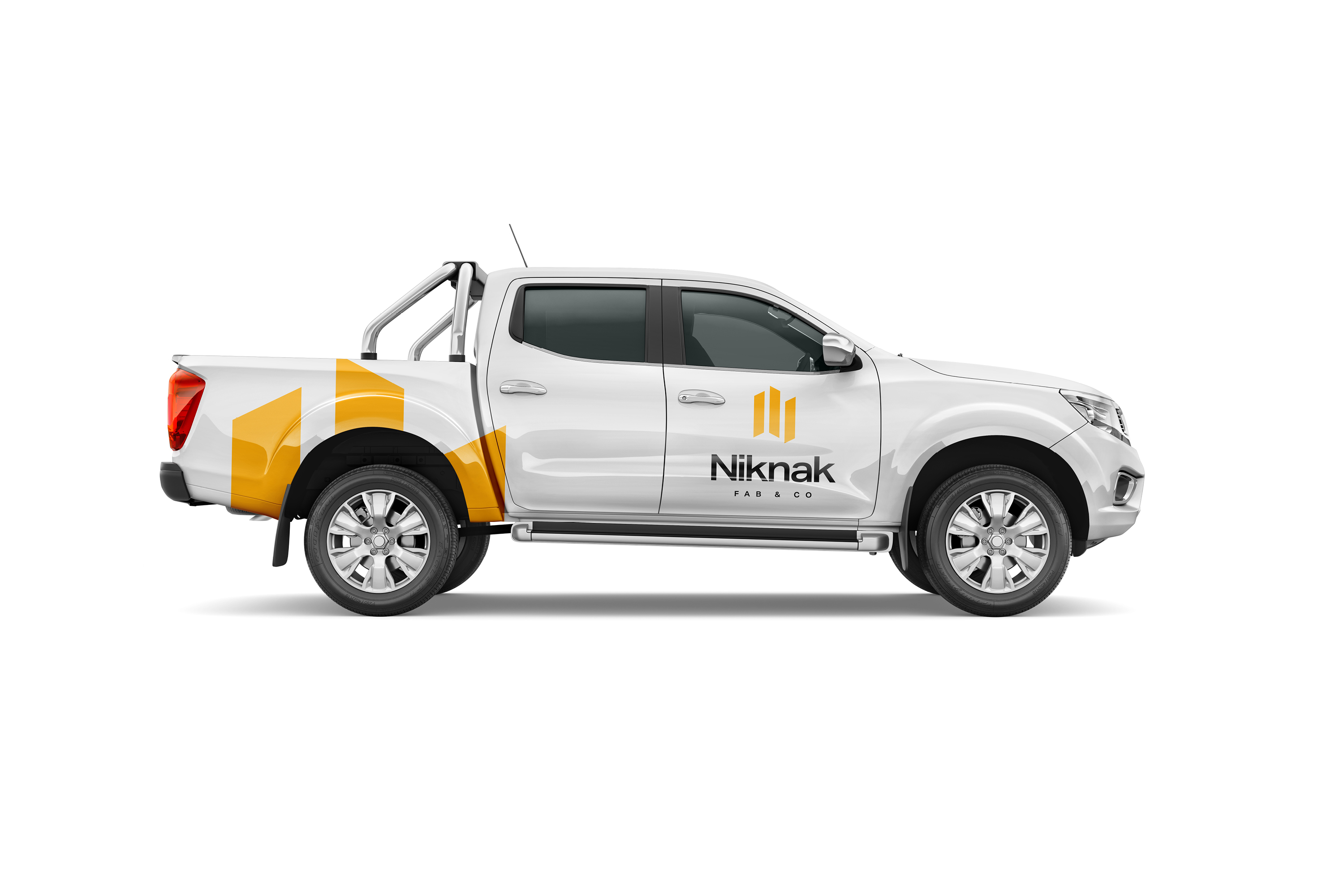
Niknak Fab & Co needed a brand that could stand strong in a competitive fabrication market — something sharp, recognisable, and built to scale across vehicles, uniforms, signage, and digital platforms.
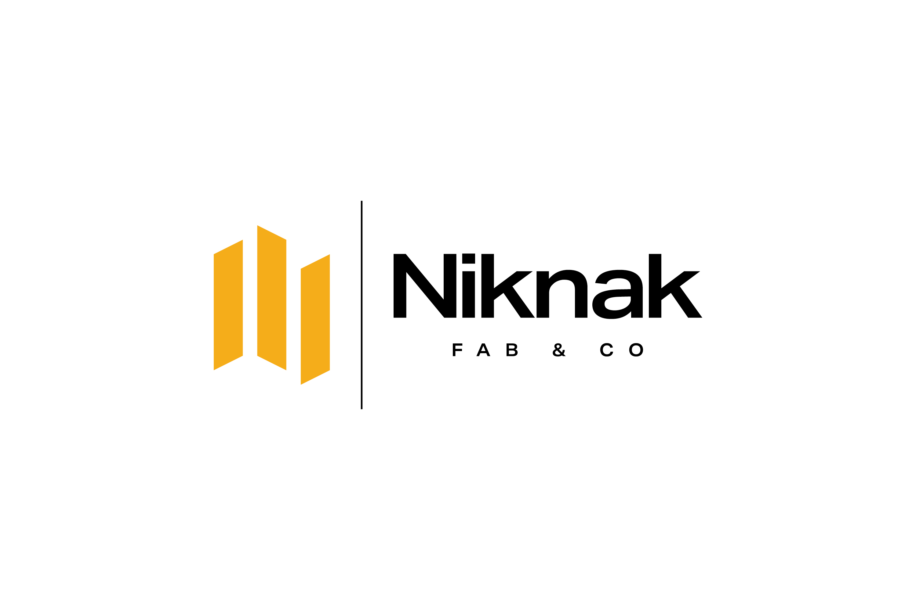
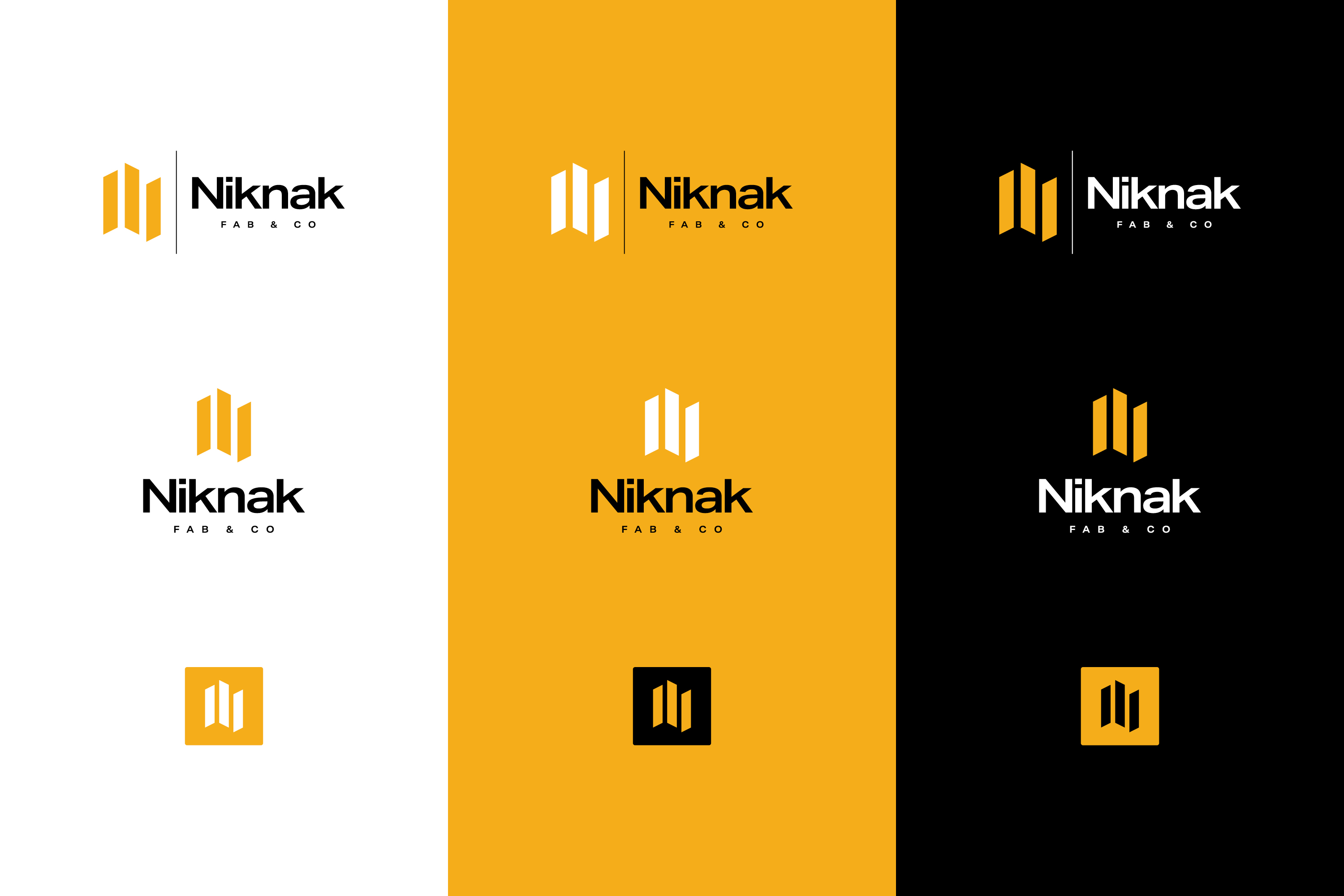
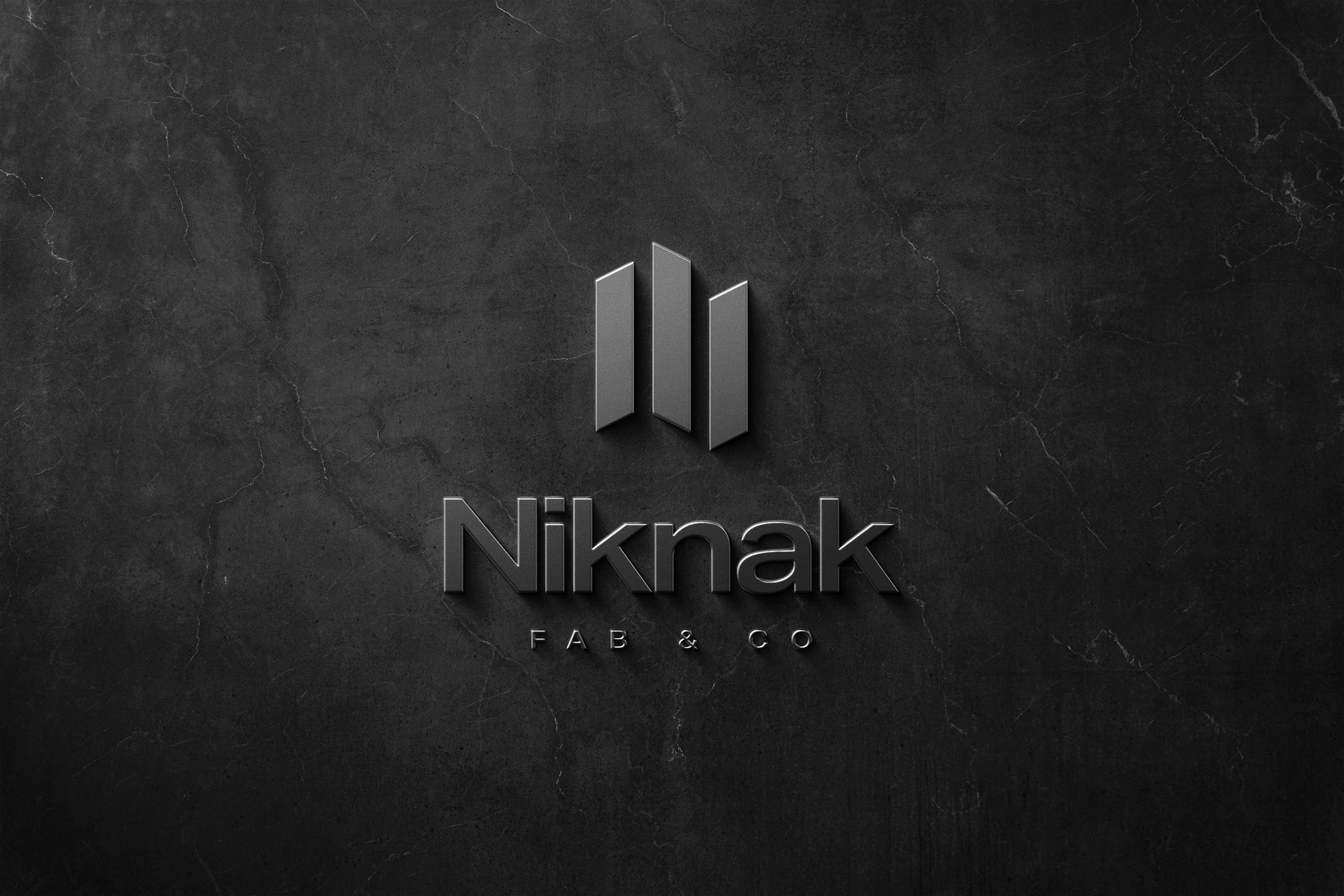
The solution is a modern, industrial-inspired identity anchored by a bold three-bar mark. The symbol reflects fabrication, structure, and precision, while the colour palette balances reliability (black) with a confident, energetic accent (construction yellow).
The logotype uses clean, geometric typography to reinforce craftsmanship and consistency. Clear spacing, flexible lockups, and a simple vertical divider ensure the brand performs across all touchpoints.
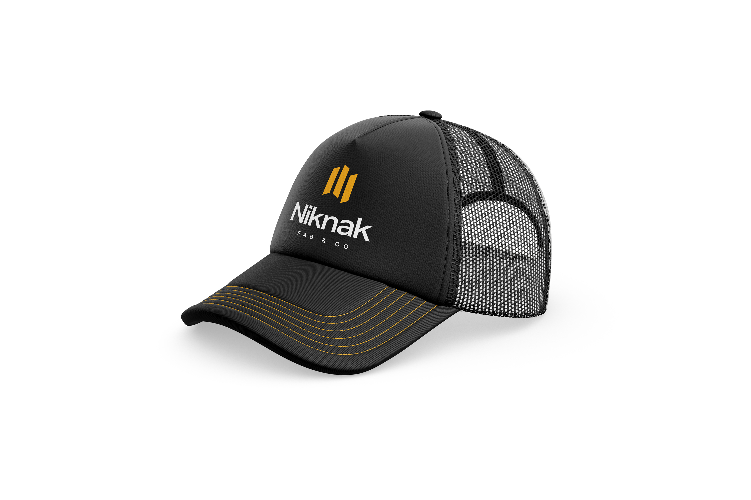
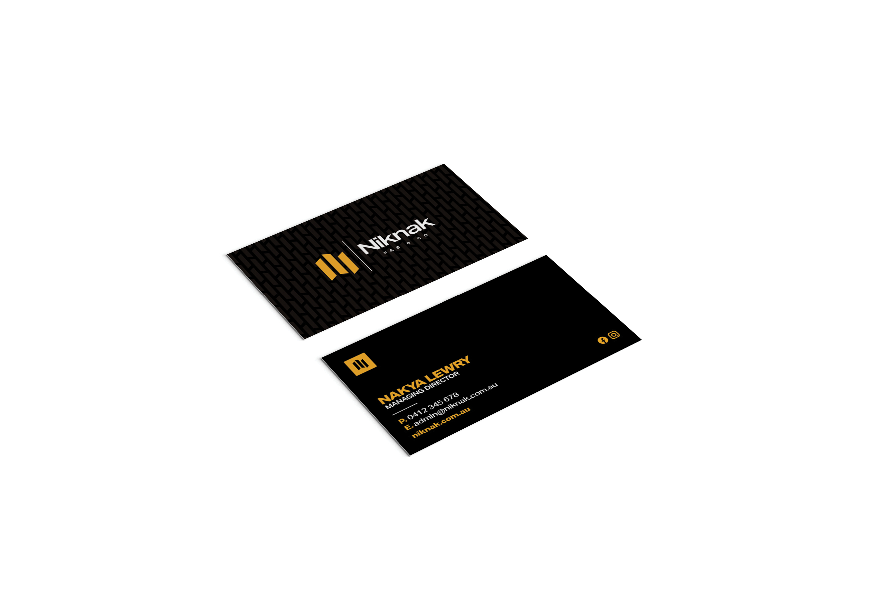
Deliverables included the primary logo suite, colour variations, icon applications, vehicle livery, merchandise concepts, and business card design. The final identity gives Niknak Fab & Co a professional, cohesive brand presence that feels as robust as the work they produce.
Ready to chat?
Are you ready to grow your business with a professional design?
Get in touch today by phone, email or social to discuss your project and receive a free quote.